Reviewing a digital project across multiple screens before presentation

Project case study

Productivity

Time Care Log

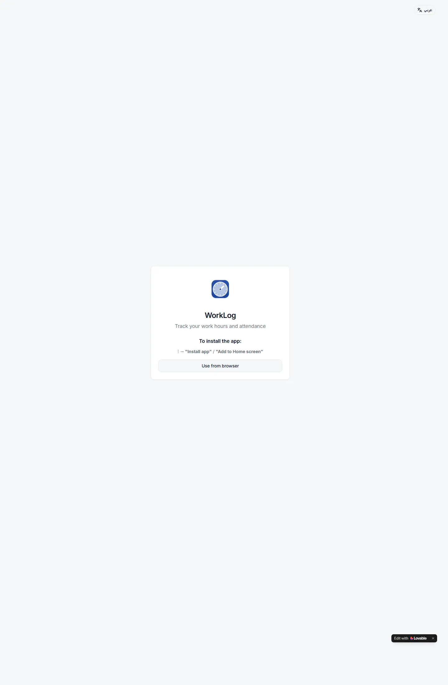
WorkLog مشروع يقدّم أداة تتبع ساعات العمل من خلال صفحة تثبيت بسيطة ومباشرة، تجعل قيمة المنتج واضحة في ثوانٍ وتناسب الاستخدام السريع من الهاتف.

تجربة تثبيت وعرض أولي لتطبيق تتبع ساعات العمل، مصممة كصفحة PWA خفيفة توضّح فكرة المنتج بسرعة.

Time Care Log

Project type

أداة إنتاجية

Audience

الأفراد والفرق الصغيرة

Role

بناء منتج مباشر وعملي

Details made easier

Read case details with a visual rhythm that supports the decision.

When you open a project page, the goal is to understand the context, not scroll through repeated visuals. These two images create a clean pause between the intro and the details so the decisions behind the work are easier to follow.

Presentation room prepared for a digital project
Digital project visual for presenting outcomes

Challenge

What did the project really need?

كان التحدي هو تقديم منتج إنتاجية في شاشة واحدة واضحة ومختصرة، مع الحفاظ على إحساس بالثقة وسهولة الفهم من أول زيارة.
Approach

How was the solution shaped?

تم بناء التجربة حول بطاقة تثبيت مركزية، رسالة قصيرة، وأزرار مباشرة توضّح كيف يبدأ المستخدم باستخدام التطبيق أو إضافته للشاشة الرئيسية.

Outcome

What did the project deliver?

النتيجة واجهة تثبيت نظيفة وعملية تعكس منتجًا صغيرًا واضح الهدف، وتضيف للبورتفوليو مثالًا جيدًا على صفحات المنتجات الإنتاجية الخفيفة.

Focus

Speed

Usability

Install clarity

Tech stack

Installable PWA experienceProductivity workflowClean entry pointMobile-first presentation

Deliverables

صفحة تثبيت
رسالة منتج واضحة
تجربة موبايل خفيفة
نقطة دخول مباشرة

Experience highlights

نظافة بصرية

خطوات قصيرة

رسالة مباشرة

تركيز على البداية السريعة

Project snapshots

A closer look at the interface

Time Care Log 1

Related work

Explore more projects

Work as decision proof

Work pages convince when they connect visuals to outcomes and execution

We add context around each project: why it existed, the challenge, the solution, and what you can understand from browsing the work.

12+

projects to inspect

4

ways to browse work

1

clearer decision after browsing

Reviewing a digital project across multiple screens before presentation
A mockup and interface planning shot for a digital project

Page story

Specific angle for worklog

This page does not repeat the same Work as decision proof story. Media, stages, and questions are tied to the worklog path so its goal is clear.

Before enrichment

Similar pages inside projects

When pages reuse the same hero and questions, visitors feel worklog is only a title change.

Generic media weakens contrast

Image or video must serve the page question, not act as a background from one repeated family.

After enrichment

Presentation rhythm 5

We assign a different rhythm to worklog: map, proof wall, dashboard, or editorial narrative depending on the route.

Route-linked questions

Questions mention worklog directly and explain a different hesitation point instead of copied FAQs.

Purposeful motion

Video serving worklog

The video acts as a visual pause specific to worklog, not the same feeling as neighboring pages.

Break repetition

The video changes reading rhythm instead of relying on similar cards.

Clarify context

It adds context for worklog and its role inside the journey.

Your questions before deciding

Answers that reduce hesitation before contact

Why does worklog need a different design?

Because worklog answers a different question, and repeated design hides that difference from the client.

How do we prevent repeated copy?

Problem, solution, stages, and questions are tied to worklog and its role inside the section.

Does variety break the site identity?

No. Identity stays consistent through color and typography, while presentation rhythm changes by page goal.

Make every project a reason to reach out

Good work is not only displayed; it explains why you can trust the execution.

Start the conversation