Problem
Customers do not leave only because of the product
Customers often leave because sizes are unclear, images are weak, shipping is vague, or payment feels unsafe. Trust is part of the design.

Blog category
E-commerce
This gathers Notaq thinking on stores: how customers see products, feel safe before payment, move from cart to checkout, and feel after purchase that the brand is organized.
Depth signals
6
trust moments before payment
3
critical buying stages
1
connected post-order journey
Problem
Customers often leave because sizes are unclear, images are weak, shipping is vague, or payment feels unsafe. Trust is part of the design.
Method
Every step from category to product page to cart needs simple proof: details, guarantee, reviews, return policy, or follow-up message.
Execution
We reduce unnecessary fields, clarify order details before surprises, and keep interaction fast on mobile where most decisions happen.
Outcome
The journey does not end at payment. Confirmation messages, tracking, and support make customers feel the brand is worth returning to.
Clear working system
Each category here is not just a list of posts. It is a complete thinking angle that helps clients see the method and depth before starting a project.
We structure discovery so customers reach the right product without effort.
We order images, benefits, guarantees, and reviews around the buying decision.
We reduce hesitation and clarify shipping, payment, and the next step.
Notaq designs messages and updates that extend trust after the order closes.
Execution details
The details here are intentional: every card explains a layer of decision, trust, or usage.
Images alone do not sell. Sizes, materials, usage, comparisons, and FAQs make the decision clearer.
Safe payment, return policy, reviews, and contact routes should appear at decision moments, not far away at the end.
Strong offers are not noisy. We show them when they help customers choose better, not when they interrupt buying.
Post-purchase experience, messages, and support drive return visits more than a quick discount without a system.
Important questions
Visual style matters, but clarity and trust matter more: product information, shipping, payment, returns, and support.
No. Checkout matters, but it comes after a full journey of discovery, trust, and product understanding.
Articles
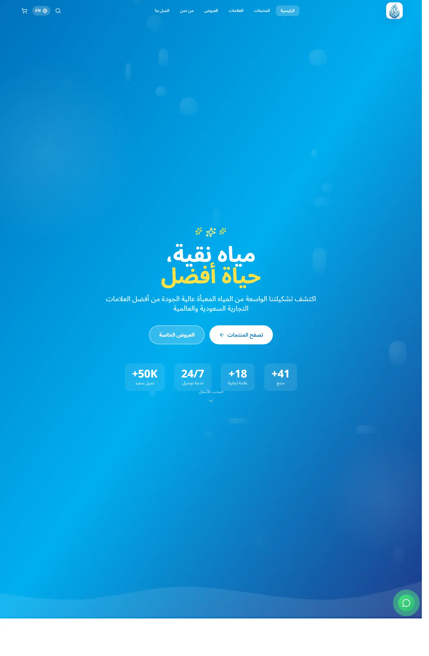
An analysis of the Middle East e-commerce market and how to build successful platforms that match local customer expectations.
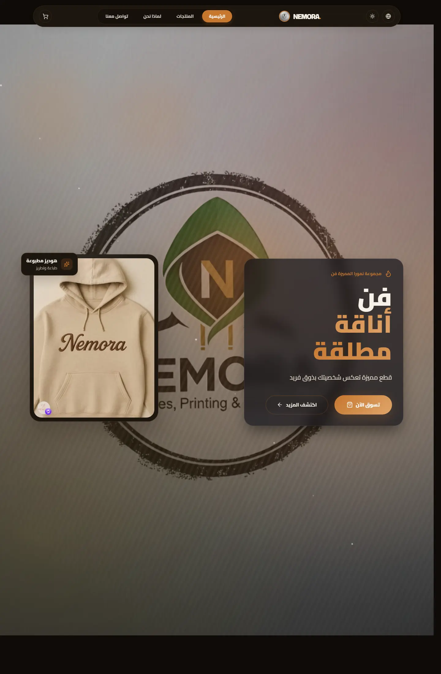
A look at emerging e-commerce trends and how brands can prepare for them across global markets.
Next step
If your company needs a service page, store, or interface that feels organized from the first visit, organize the requirements in a quick brief or explore the closest service path.
Content that teaches and sells quietly
We enrich posts and categories with context, internal links, and practical summaries so reading leads to contact instead of exit.
3
knowledge categories
6+
questions turned into posts
2
follow-up paths after reading

Page story
This page does not repeat the same Content that teaches and sells quietly story. Media, stages, and questions are tied to the ecommerce path so its goal is clear.
Before enrichment
When pages reuse the same hero and questions, visitors feel ecommerce is only a title change.
Image or video must serve the page question, not act as a background from one repeated family.
After enrichment
We assign a different rhythm to ecommerce: map, proof wall, dashboard, or editorial narrative depending on the route.
Questions mention ecommerce directly and explain a different hesitation point instead of copied FAQs.
Purposeful motion
The video acts as a visual pause specific to ecommerce, not the same feeling as neighboring pages.
The video changes reading rhythm instead of relying on similar cards.
It adds context for ecommerce and its role inside the journey.
Your questions before deciding
Because ecommerce answers a different question, and repeated design hides that difference from the client.
Problem, solution, stages, and questions are tied to ecommerce and its role inside the section.
No. Identity stays consistent through color and typography, while presentation rhythm changes by page goal.
When you understand the problem well, asking for the solution becomes easier and clearer.