Reviewing a digital project across multiple screens before presentation

Project case study

EducationCore dashboard edition

Dashboard Ana Map

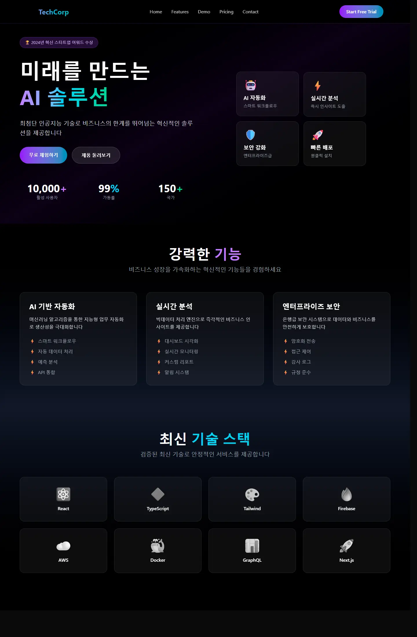
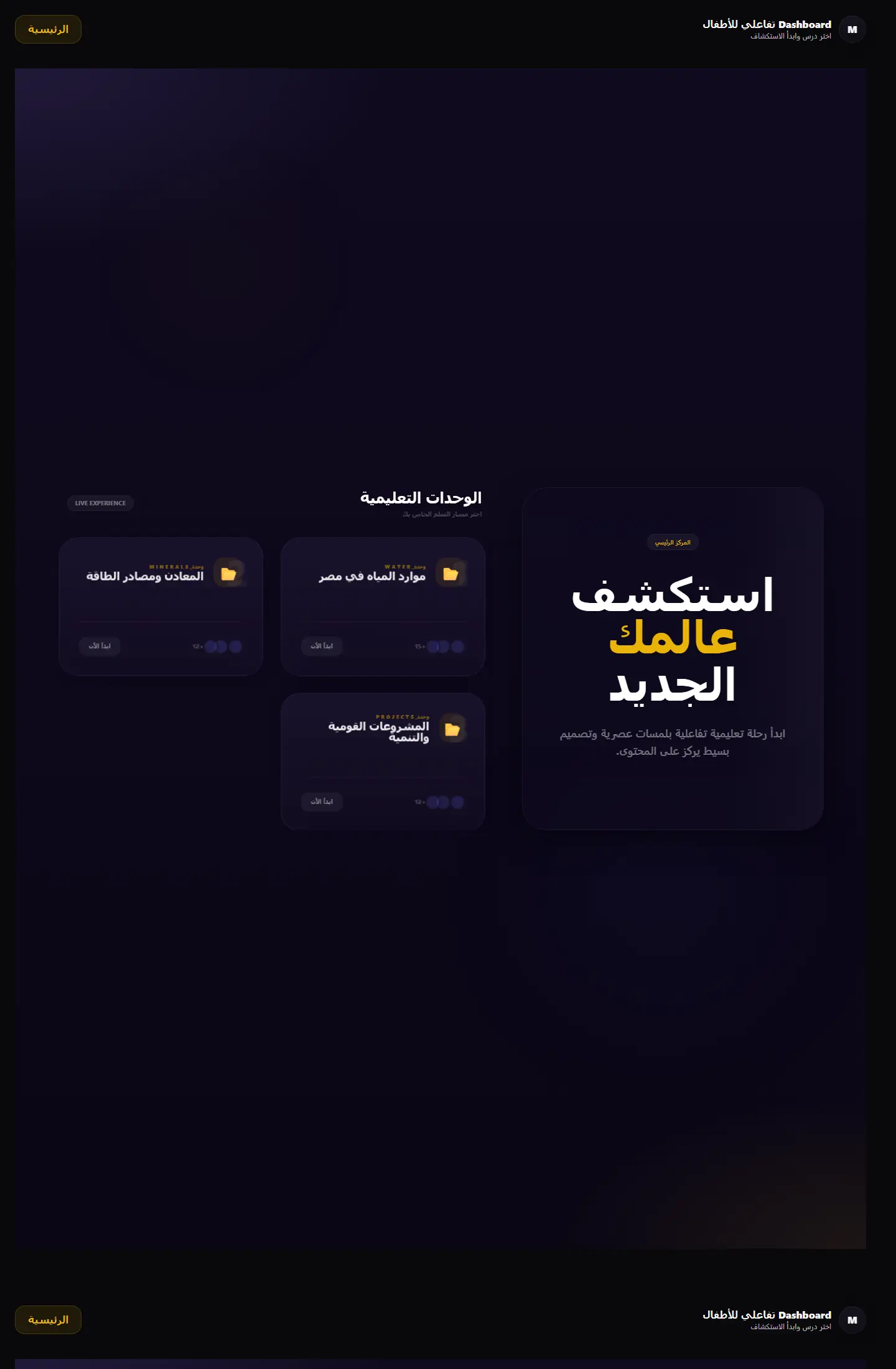
هذا المشروع ينقل المحتوى التعليمي من مجرد صفحات عرض إلى واجهة مركزية تجمع الوحدات والأنشطة داخل بنية واضحة، وهو ما يعطيه طابع المنتج التعليمي القابل للتوسع.

بوابة تعلم جغرافية تعرض الوحدات التعليمية والمهام في قالب منظّم يميل إلى المنتج التعليمي أكثر من لوحة الإدارة التقليدية.

Dashboard Ana Map

Project type

لوحة تحكم تعليمية

Audience

الطلاب، المشرفون، ومطورو المنصات التعليمية

Role

تصميم تنظيم البيانات والرحلة الداخلية

Details made easier

Read case details with a visual rhythm that supports the decision.

When you open a project page, the goal is to understand the context, not scroll through repeated visuals. These two images create a clean pause between the intro and the details so the decisions behind the work are easier to follow.

Presentation room prepared for a digital project
Digital project visual for presenting outcomes

Challenge

What did the project really need?

كان المطلوب هو تنظيم المحتوى التعليمي في واجهة تبدو متماسكة وسهلة الفهم، من دون أن تتحول إلى شاشة إدارية جافة أو مزدحمة.
Approach

How was the solution shaped?

تم بناء التجربة حول بطاقات وحدات، تقسيمات مرئية هادئة، وأقسام مختصرة تسمح بفهم المسار التعليمي من أول نظرة.

Outcome

What did the project deliver?

الواجهة النهائية مناسبة كبوابة منتج تعليمي أو طبقة تنظيم رئيسية داخل منصة أكبر، وتُظهر خبرة في بناء شاشات تعليمية منظمة وقابلة للتطوير.

Focus

Module clarity

Educational structure

Portal-like navigation

Tech stack

Learning portal UIModule cardsMap-related statesResponsive educational layout

Deliverables

لوحة رئيسية
بطاقات متابعة
تنظيم للمحتوى
هيكل مرئي بسيط

Experience highlights

بيانات واضحة

بطاقات كبيرة

نبرة تعليمية هادئة

سهولة تصفح

Project snapshots

A closer look at the interface

Dashboard Ana Map 1

Same idea editions

Other versions kept inside this project family

Netlify Edition
Education

Netlify Edition

Netlify edition

نسخة أخرى من لوحة التعلم الجغرافي تظهر اتساع التجربة وتطورها بصريًا عبر أكثر من إصدار منشور.

Iterative UI designDashboard variation
Page
Version 6
Education

Version 6

Version 6

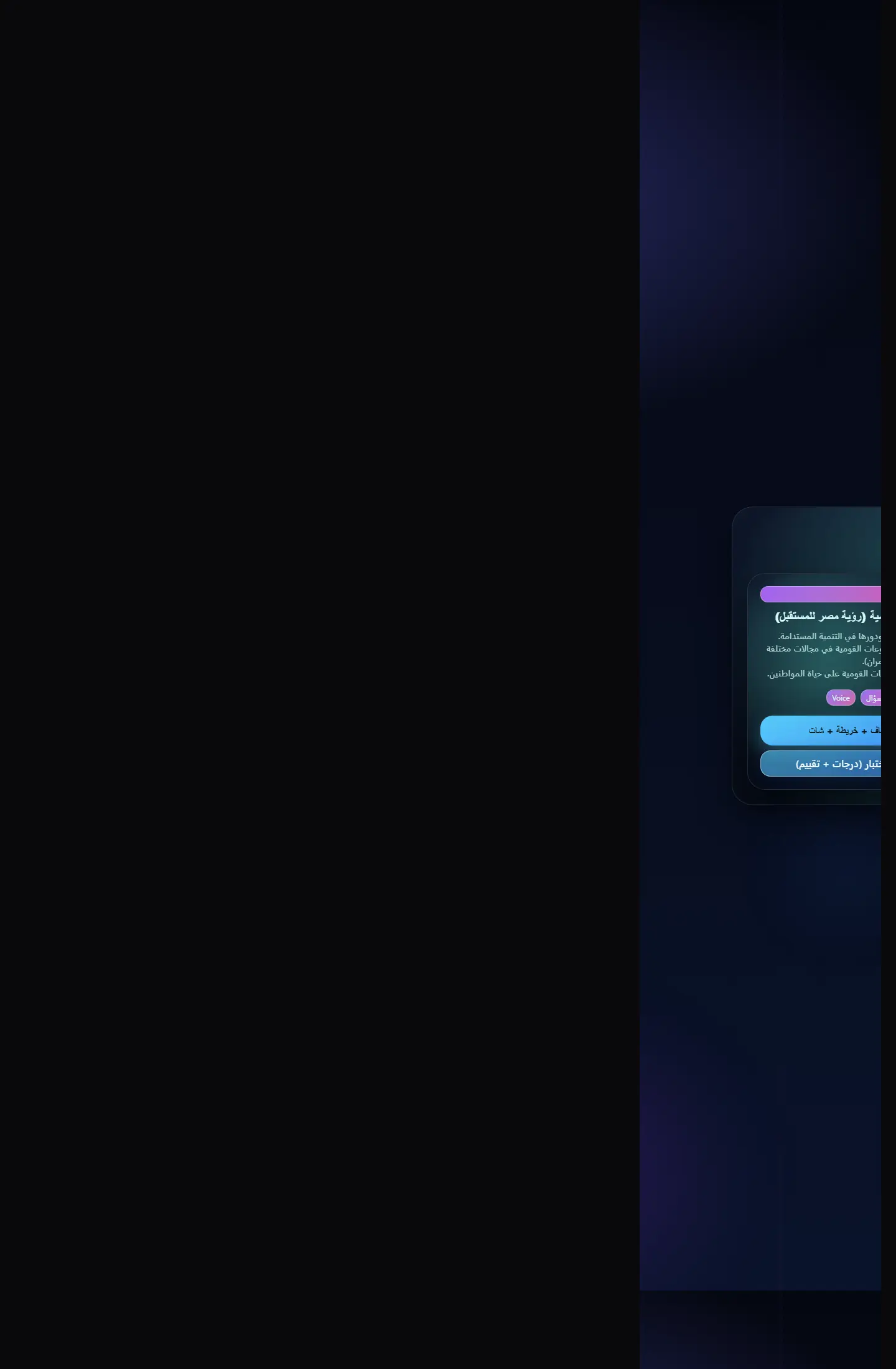
إصدار يركز على جانب الاختبارات داخل التجربة التعليمية الجغرافية مع واجهات مناسبة للمنافسة والتقييم.
Quiz dashboardProgress states
Page
Version 12
Education

Version 12

Version 12

نسخة أنضج من لوحة الاختبارات الجغرافية، تظهر تطور الهيكل البصري والقدرة على الوصول إلى منتج أكثر اكتمالًا.
Refined educational UIVersioned product design
Page
Quiz Dashboard
Education

Quiz Dashboard

Focused edition

واجهة تقييم جغرافي تجمع بين الاختبارات والتنظيم البصري في نسخة مختصرة وفعّالة للعرض.

Quiz-first layoutEducational cards
Page

Related work

Explore more projects

Work as decision proof

Work pages convince when they connect visuals to outcomes and execution

We add context around each project: why it existed, the challenge, the solution, and what you can understand from browsing the work.

12+

projects to inspect

4

ways to browse work

1

clearer decision after browsing

Reviewing a digital project across multiple screens before presentation
A mockup and interface planning shot for a digital project

Page story

Specific angle for kids geo dashboard

This page does not repeat the same Work as decision proof story. Media, stages, and questions are tied to the kids geo dashboard path so its goal is clear.

Before enrichment

Similar pages inside projects

When pages reuse the same hero and questions, visitors feel kids geo dashboard is only a title change.

Generic media weakens contrast

Image or video must serve the page question, not act as a background from one repeated family.

After enrichment

Presentation rhythm 1

We assign a different rhythm to kids geo dashboard: map, proof wall, dashboard, or editorial narrative depending on the route.

Route-linked questions

Questions mention kids geo dashboard directly and explain a different hesitation point instead of copied FAQs.

Purposeful motion

Video serving kids geo dashboard

The video acts as a visual pause specific to kids geo dashboard, not the same feeling as neighboring pages.

Break repetition

The video changes reading rhythm instead of relying on similar cards.

Clarify context

It adds context for kids geo dashboard and its role inside the journey.

Your questions before deciding

Answers that reduce hesitation before contact

Why does kids geo dashboard need a different design?

Because kids geo dashboard answers a different question, and repeated design hides that difference from the client.

How do we prevent repeated copy?

Problem, solution, stages, and questions are tied to kids geo dashboard and its role inside the section.

Does variety break the site identity?

No. Identity stays consistent through color and typography, while presentation rhythm changes by page goal.

Make every project a reason to reach out

Good work is not only displayed; it explains why you can trust the execution.

Start the conversation