Challenge
What did the project really need?
Turning the project idea into a clear, fast digital experience that builds trust from the first visit.

Project case study
A clear, fast storefront that organizes products into a comfortable and direct shopping experience.
A clear, fast storefront that organizes products into a comfortable and direct shopping experience.
Project type
E-commerce
Audience
Clients and target users
Role
Digital experience design and development
Details made easier
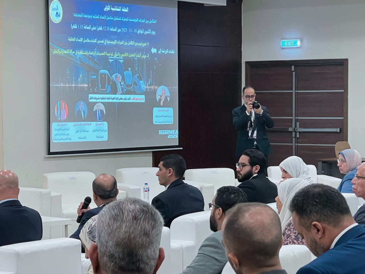
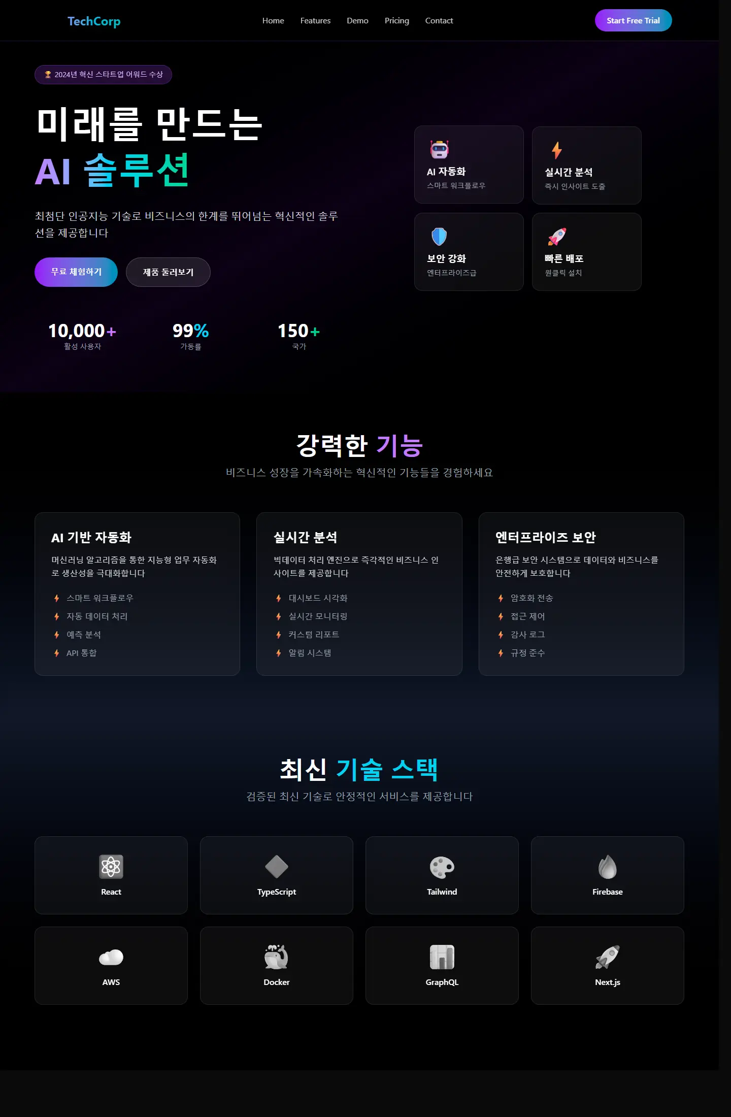
When you open a project page, the goal is to understand the context, not scroll through repeated visuals. These two images create a clean pause between the intro and the details so the decisions behind the work are easier to follow.
Challenge
Turning the project idea into a clear, fast digital experience that builds trust from the first visit.
Approach
A responsive interface was built around user intent, content clarity, and the most important next action.
Outcome
A live, presentation-ready experience that is easy to explore across mobile and desktop.
Focus
تنظيم المنتجات
تصفح سريع
تجربة شراء
Tech stack
Deliverables
Experience highlights
سرعة
وضوح
سهولة الوصول
Project snapshots
Related work
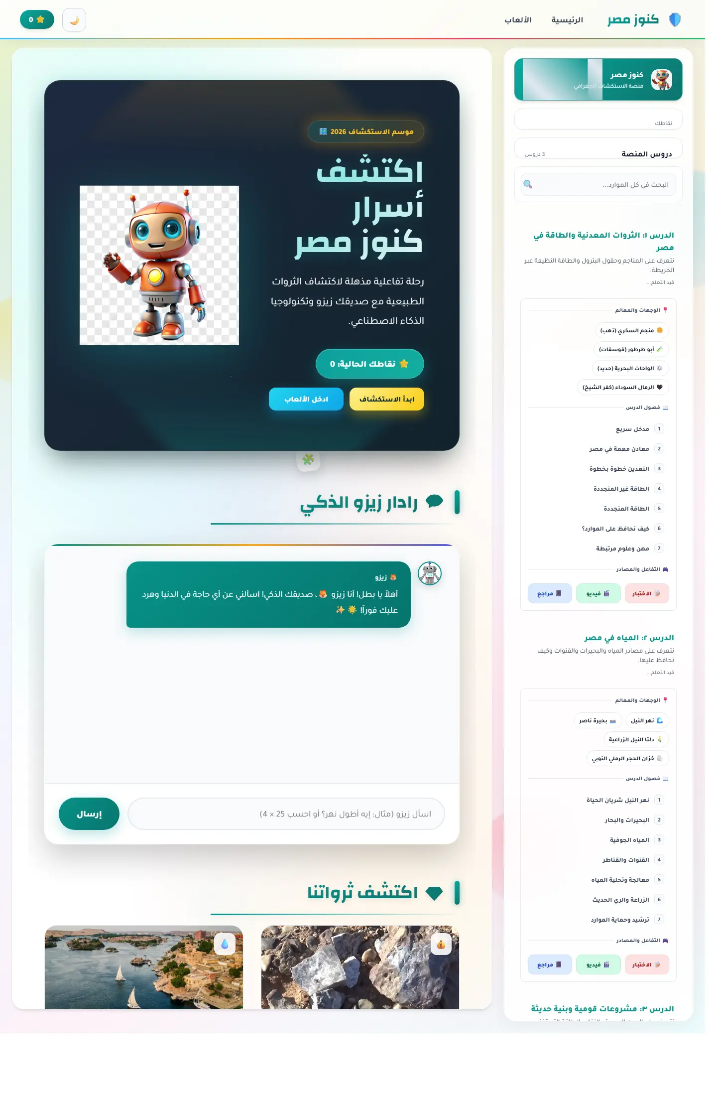
منصة اكتشاف تعليمية تربط الخريطة المصرية بالآثار والمحتوى الثقافي ومساعد ذكي يجعل التعلم أقرب للعبة استكشاف.
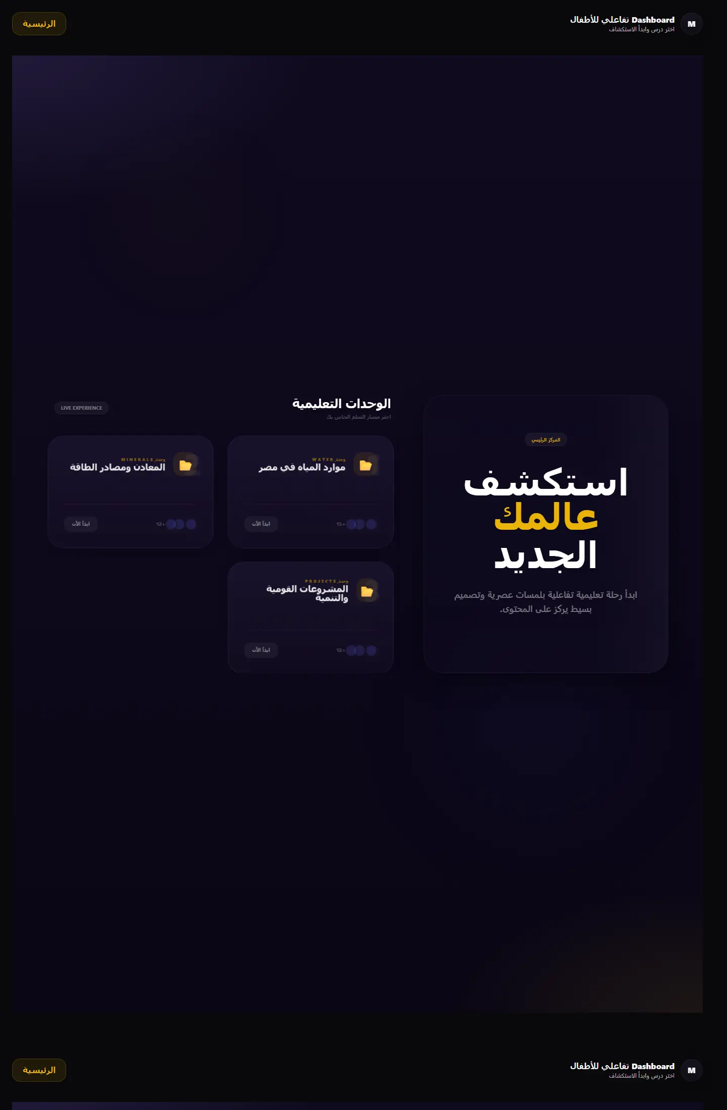
بوابة تعلم جغرافية تعرض الوحدات التعليمية والمهام في قالب منظّم يميل إلى المنتج التعليمي أكثر من لوحة الإدارة التقليدية.
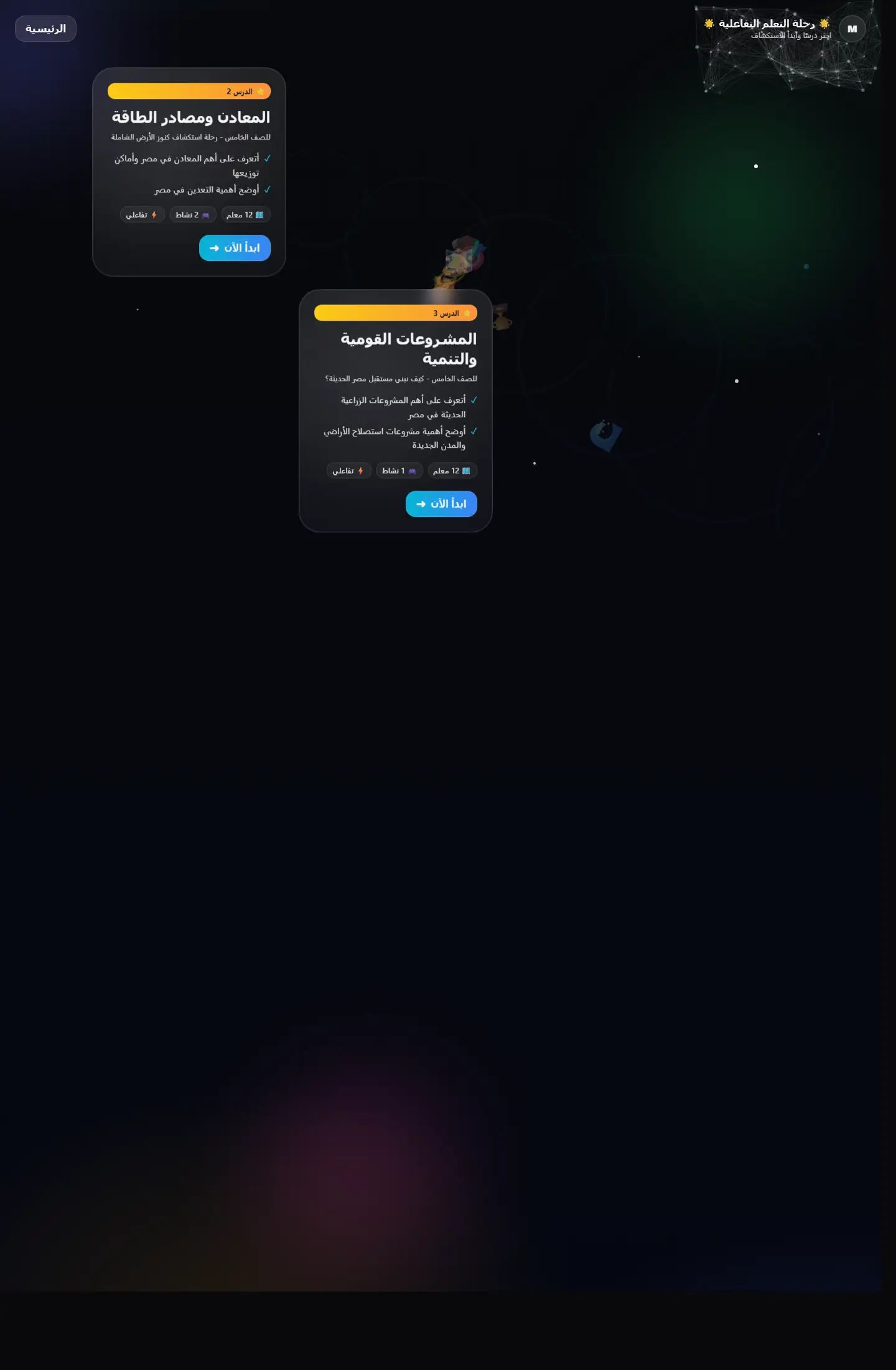
واجهة تعليمية تقدم التعلّم كرحلة متتابعة بدل صفحات منفصلة، مع اهتمام واضح بالتشويق والتنقل المنهجي.