Challenge
What did the project really need?
The challenge was to make a straightforward product feel premium without clutter, while keeping purity and credibility visible from the first screen.
Project case study
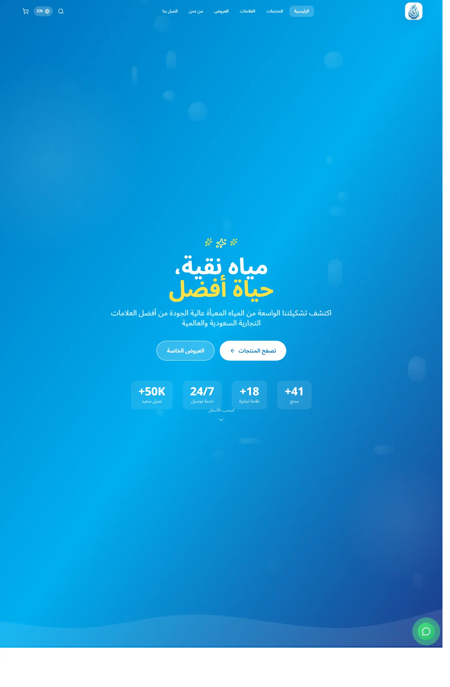
Reeq presents a premium water brand through a calm and structured storefront that balances product benefits, trust signals, and a clean consumer-facing presentation.
A clean brand-led storefront for a premium water label, focused on trust, product clarity, and health-oriented messaging.
Project type
Brand storefront / product shop
Audience
Consumer brands and audiences looking for clear product presentation
Role
Shaping the product presentation and building a lightweight storefront
Details made easier
When you open a project page, the goal is to understand the context, not scroll through repeated visuals. These two images create a clean pause between the intro and the details so the decisions behind the work are easier to follow.
Challenge
The challenge was to make a straightforward product feel premium without clutter, while keeping purity and credibility visible from the first screen.
Approach
The experience leans on wide spacing, calming blue gradients, short-value messaging, and direct calls to action that move users toward the product catalog quickly.
Outcome
The result feels like a scalable brand storefront and gives the portfolio a strong consumer-product example with a confident visual identity.
Focus
Product trust
Brand clarity
Clean conversion path
Tech stack
Deliverables
Experience highlights
تدرجات هادئة
قراءة مريحة
وضوح للرسالة
حضور بصري نظيف
Project snapshots
Related work
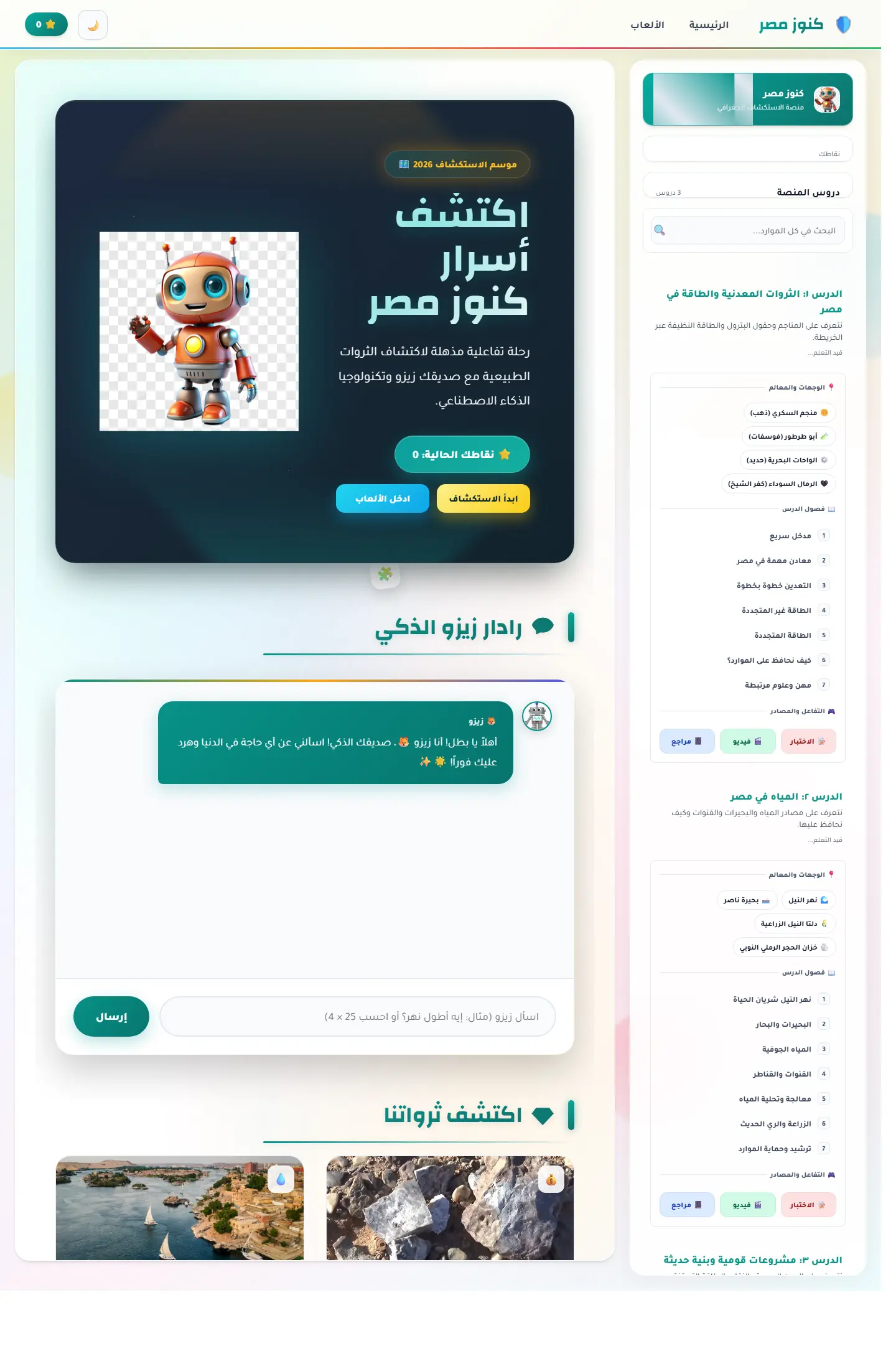
منصة اكتشاف تعليمية تربط الخريطة المصرية بالآثار والمحتوى الثقافي ومساعد ذكي يجعل التعلم أقرب للعبة استكشاف.
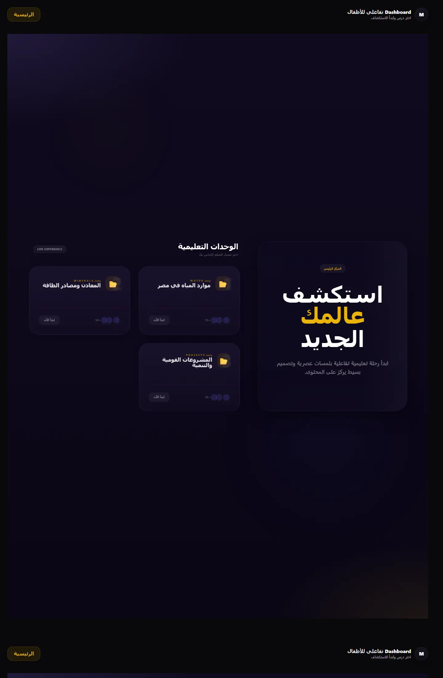
بوابة تعلم جغرافية تعرض الوحدات التعليمية والمهام في قالب منظّم يميل إلى المنتج التعليمي أكثر من لوحة الإدارة التقليدية.
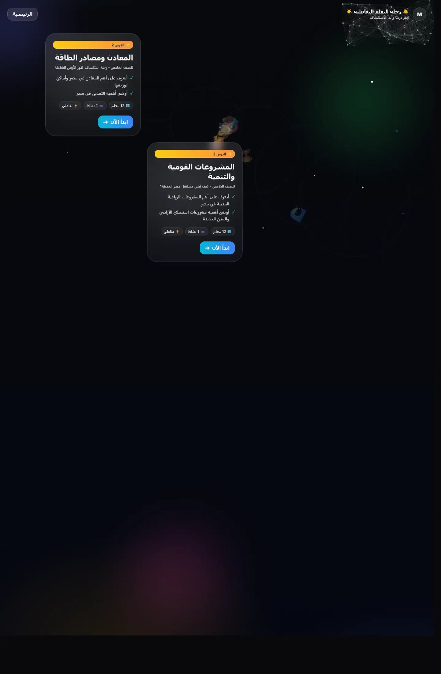
واجهة تعليمية تقدم التعلّم كرحلة متتابعة بدل صفحات منفصلة، مع اهتمام واضح بالتشويق والتنقل المنهجي.