Challenge
What did the project really need?
التحدي الأساسي هنا كان الموازنة بين عرض المنتجات كعناصر قابلة للشراء وبين إبقاء البراند نفسه حاضرًا كقصة وهوية، لا كمجرد كتالوج صور.

Project case study
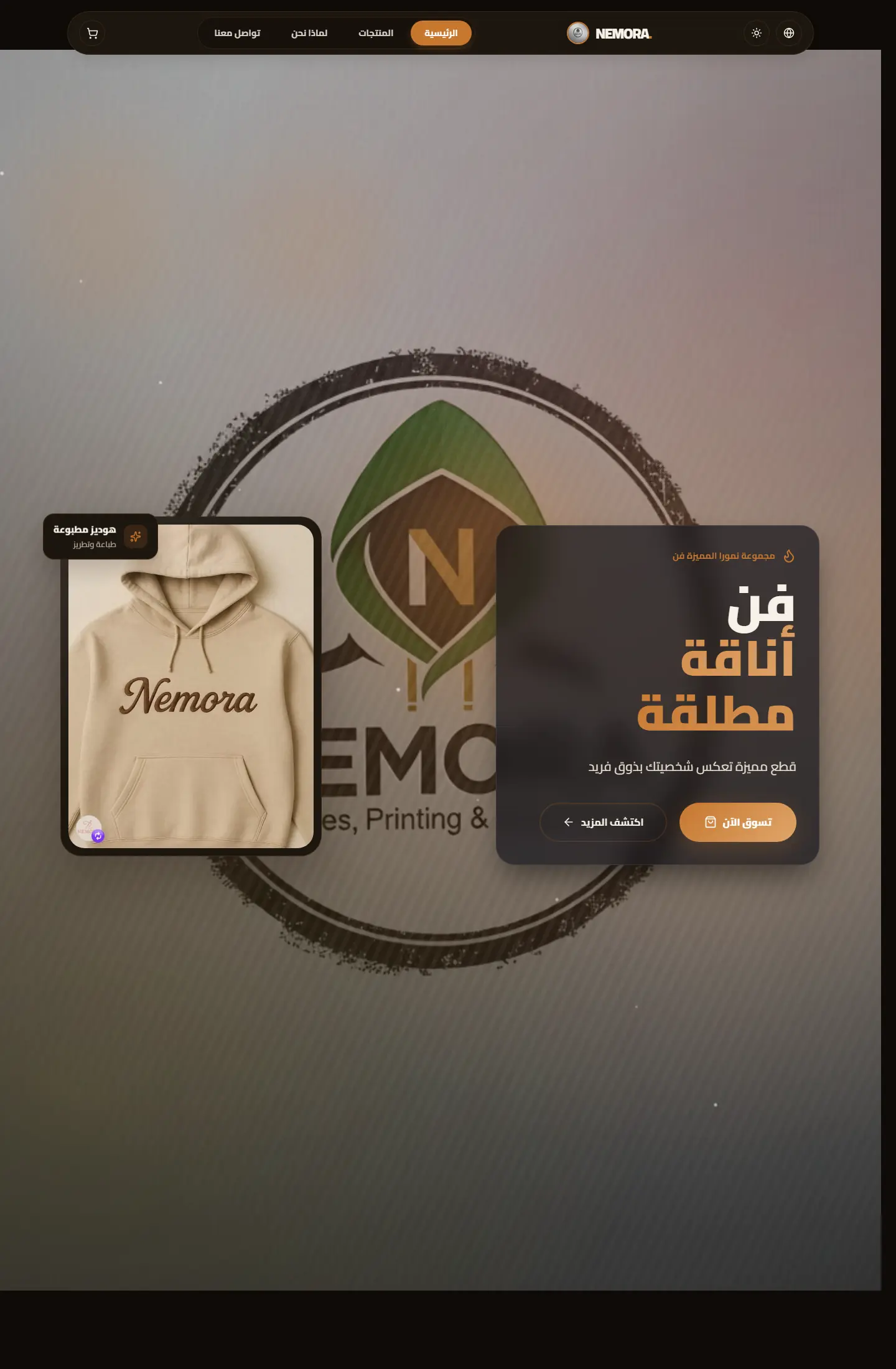
Nemora مشروع تجارة رقمية هدفه تقديم براند مطبوعات وملابس بشكل بصري قوي منذ أول شاشة، مع الاهتمام بعرض القطع، تقديم الشخصية البصرية، وصناعة تجربة شراء لا تبدو مزدحمة.
متجر رقمي لبراند ملابس مطبوعة يركز على إبراز الهوية، وضوح المنتج، وصناعة واجهة بيع تبدو حديثة ومريحة.
Project type
متجر واجهة أمامية
Audience
عملاء تجارة الأزياء والمنتجات المطبوعة
Role
تصميم التجربة، البناء البصري، وتجهيز عرض المشروع
Details made easier
When you open a project page, the goal is to understand the context, not scroll through repeated visuals. These two images create a clean pause between the intro and the details so the decisions behind the work are easier to follow.
Challenge
التحدي الأساسي هنا كان الموازنة بين عرض المنتجات كعناصر قابلة للشراء وبين إبقاء البراند نفسه حاضرًا كقصة وهوية، لا كمجرد كتالوج صور.
Approach
تم تشكيل الواجهة حول صور كبيرة، إيقاع بصري واضح، تقسيمات قصيرة، ومناطق تركّز على القطعة نفسها ثم تنقل المستخدم بسلاسة إلى التصفح أو اتخاذ قرار الشراء.
Outcome
النتيجة تبدو كمتجر أنيق ومباشر في الوقت نفسه: براند حاضر، منتج واضح، ومسار بصري مناسب للعرض أمام عميل يبحث عن شكل احترافي سريع الفهم. زيادة معدل التحويل بنسبة 35% وتقليل معدل الارتداد بنسبة 25%.
Focus
Brand presence
Product clarity
Conversion flow
Tech stack
Deliverables
Experience highlights
Hero بصري كبير
ترتيب واضح للفئات
إبراز الصور والهوية
دعوات فعل واضحة
Project snapshots
Related work
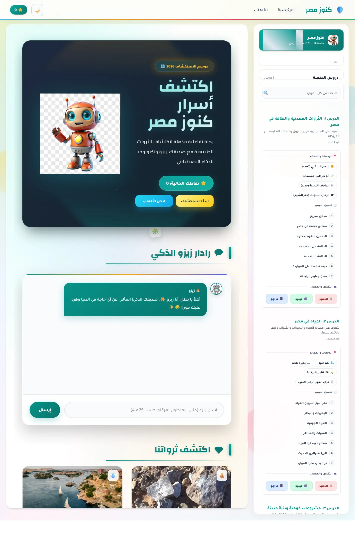
منصة اكتشاف تعليمية تربط الخريطة المصرية بالآثار والمحتوى الثقافي ومساعد ذكي يجعل التعلم أقرب للعبة استكشاف.
Focus
Cultural discovery / Map learning / Guided exploration
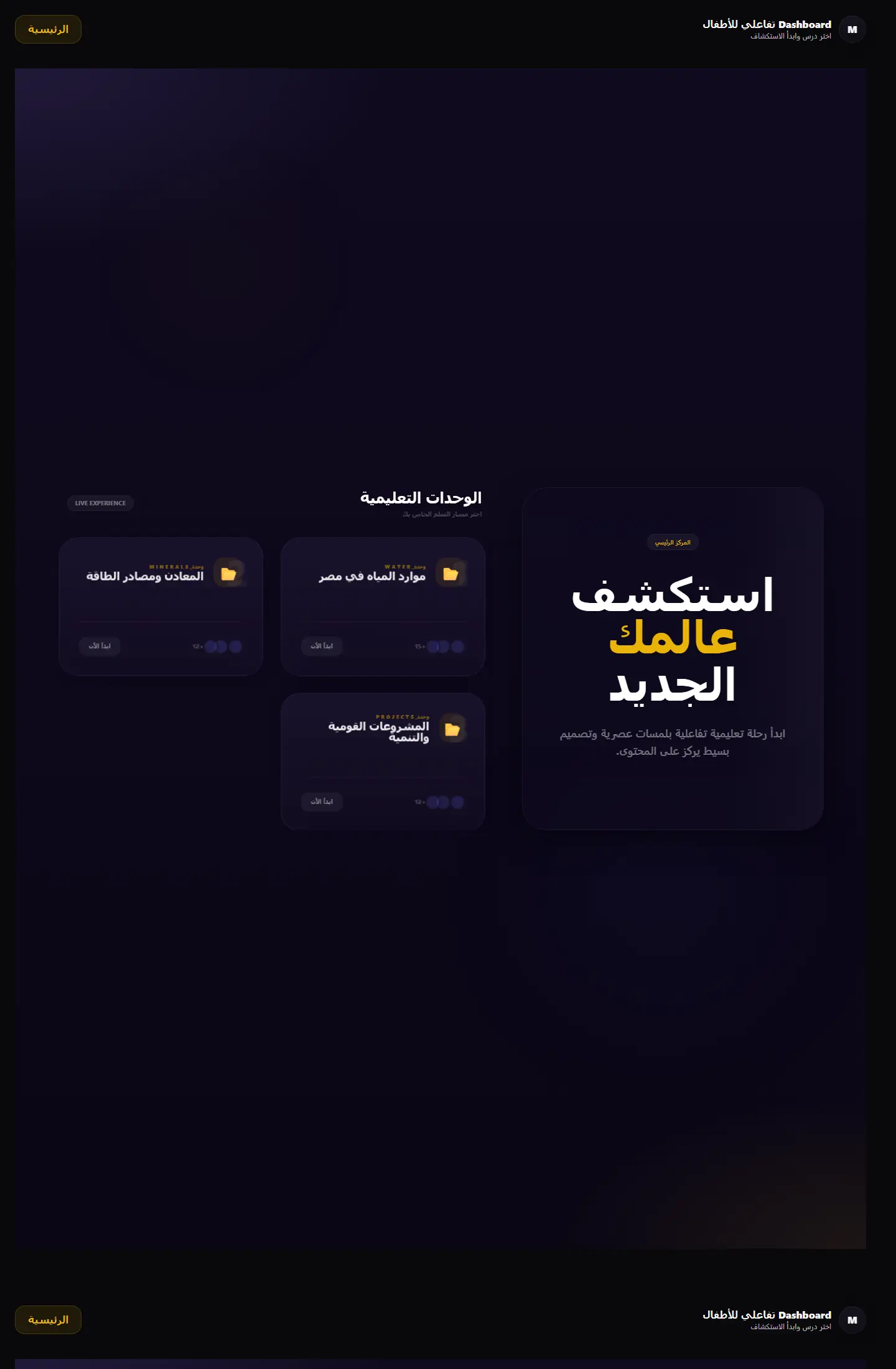
بوابة تعلم جغرافية تعرض الوحدات التعليمية والمهام في قالب منظّم يميل إلى المنتج التعليمي أكثر من لوحة الإدارة التقليدية.
Focus
Module clarity / Educational structure / Portal-like navigation
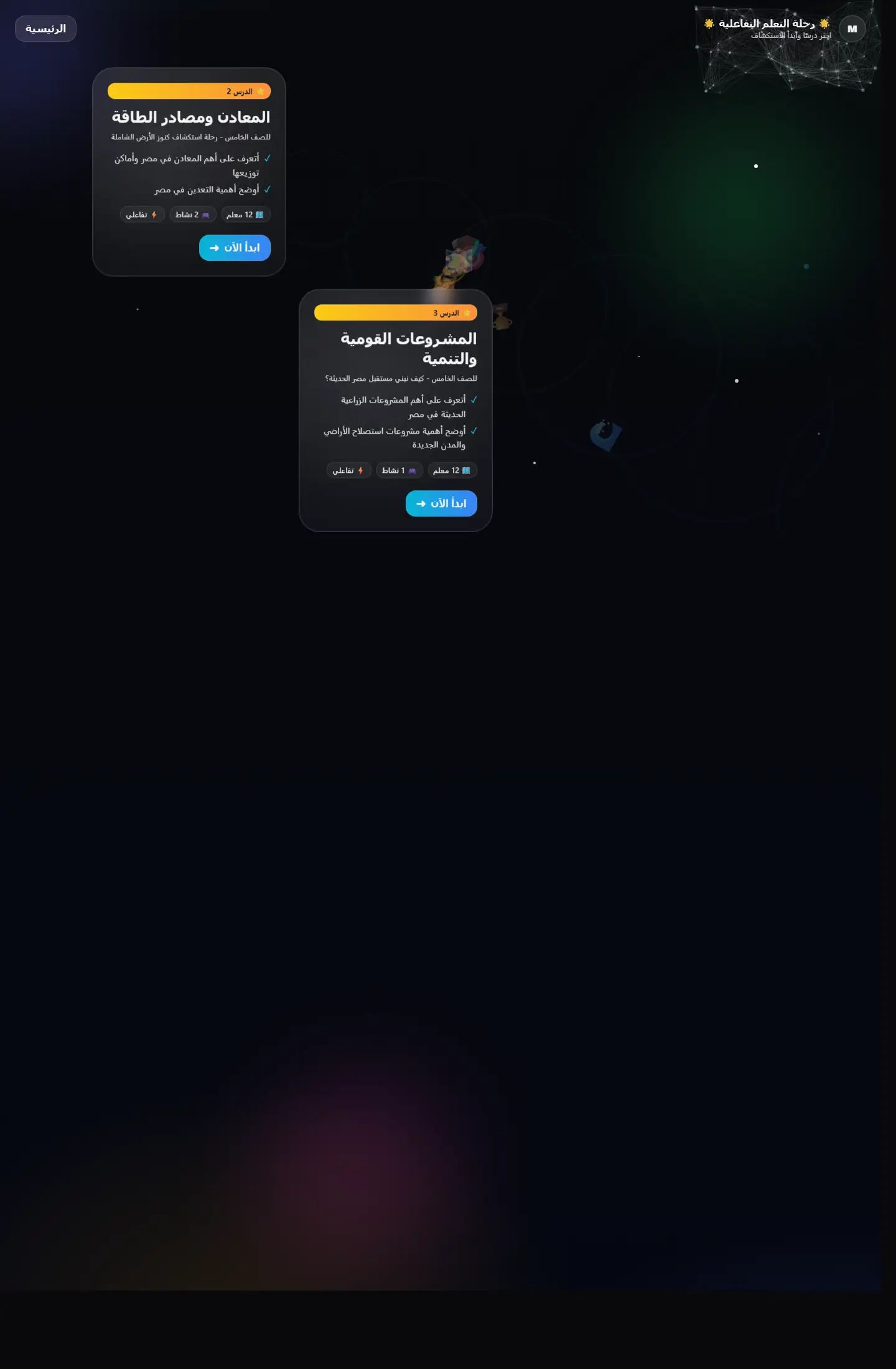
واجهة تعليمية تقدم التعلّم كرحلة متتابعة بدل صفحات منفصلة، مع اهتمام واضح بالتشويق والتنقل المنهجي.
Focus
Narrative learning / Progression / Visual continuity
Work as decision proof
We add context around each project: why it existed, the challenge, the solution, and what you can understand from browsing the work.
12+
projects to inspect
4
ways to browse work
1
clearer decision after browsing
Page story
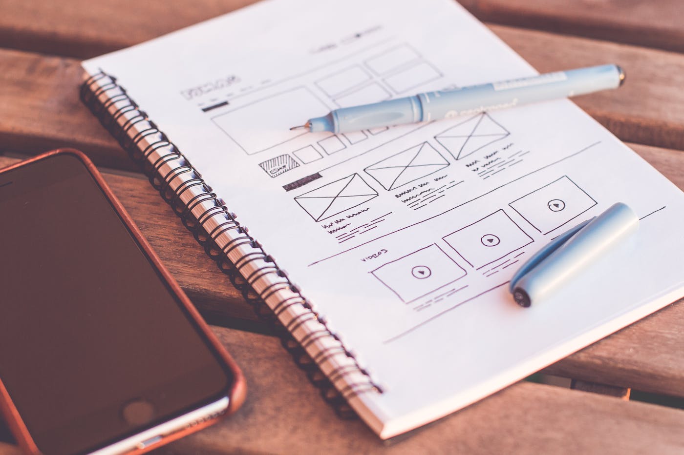
This page does not repeat the same Work as decision proof story. Media, stages, and questions are tied to the nemora path so its goal is clear.
Before enrichment
When pages reuse the same hero and questions, visitors feel nemora is only a title change.
Image or video must serve the page question, not act as a background from one repeated family.
After enrichment
We assign a different rhythm to nemora: map, proof wall, dashboard, or editorial narrative depending on the route.
Questions mention nemora directly and explain a different hesitation point instead of copied FAQs.
Purposeful motion
The video acts as a visual pause specific to nemora, not the same feeling as neighboring pages.
The video changes reading rhythm instead of relying on similar cards.
It adds context for nemora and its role inside the journey.
Your questions before deciding
Because nemora answers a different question, and repeated design hides that difference from the client.
Problem, solution, stages, and questions are tied to nemora and its role inside the section.
No. Identity stays consistent through color and typography, while presentation rhythm changes by page goal.
Good work is not only displayed; it explains why you can trust the execution.