Challenge
What did the project really need?
Invitation pages need to feel personal and memorable while staying light, clear, and instantly understandable when opened from a shared link.
Project case study
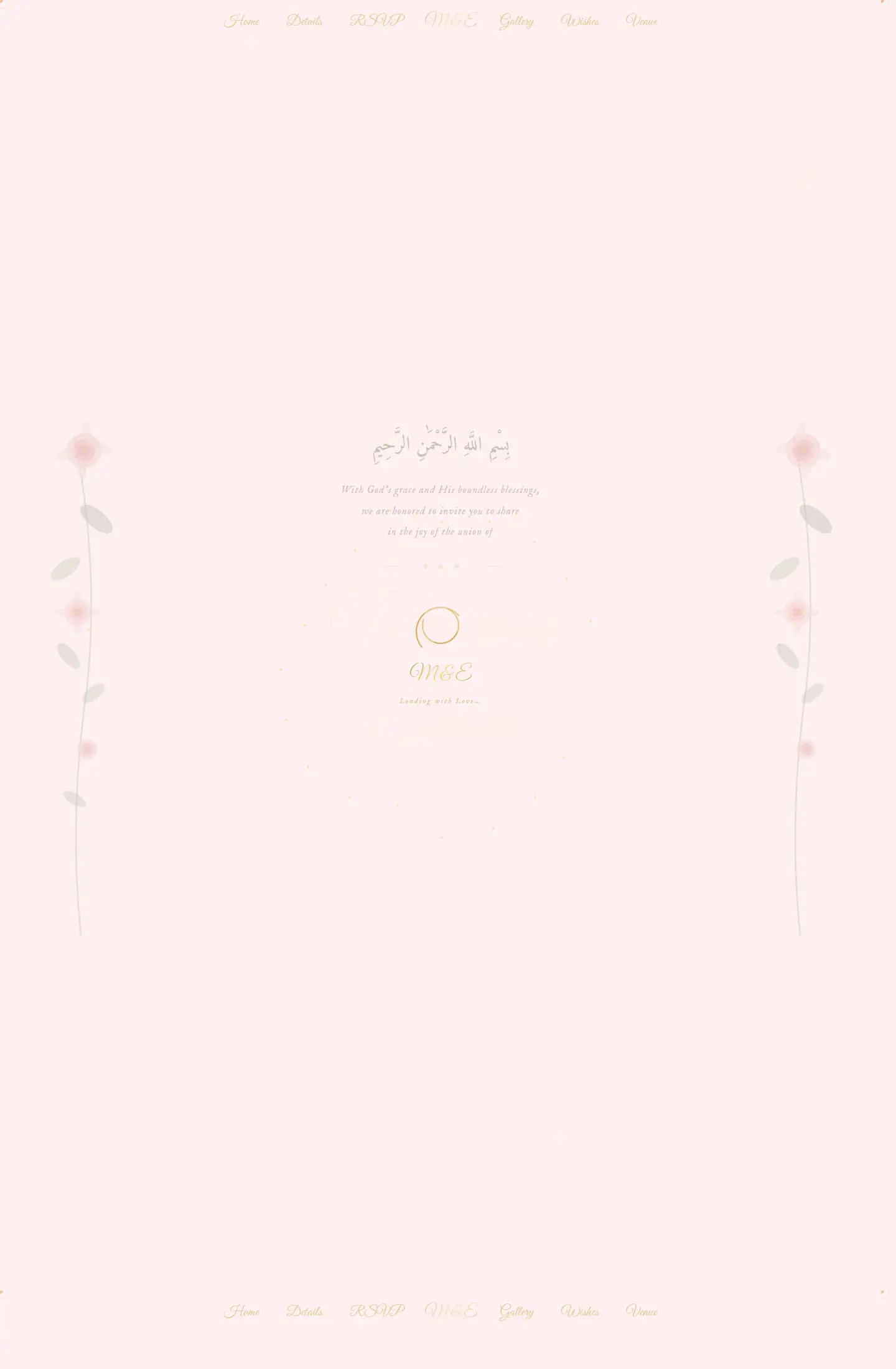
This project turns a private celebration into a refined digital invitation with a romantic tone, clear event details, and mobile-friendly reading.
An elegant digital wedding invitation that combines key event details and celebratory styling in one lightweight shareable page.
Project type
Digital invitation page
Audience
Private events, couples, and digital invitation designers
Role
Crafting the event presentation and organizing the essential invitation content
Details made easier
When you open a project page, the goal is to understand the context, not scroll through repeated visuals. These two images create a clean pause between the intro and the details so the decisions behind the work are easier to follow.
Challenge
Invitation pages need to feel personal and memorable while staying light, clear, and instantly understandable when opened from a shared link.
Approach
The design uses soft floral framing, gentle typography, and a simple reading flow that highlights the names, date, and venue without clutter.
Outcome
The final result feels like a polished invitation microsite and works well as a portfolio example for private events and celebration pages.
Focus
Celebration tone
Detail clarity
Shareable mobile experience
Tech stack
Deliverables
Experience highlights
هوية ناعمة
تسلسل هادئ
قراءة واضحة
إحساس احتفالي
Project snapshots
Related work
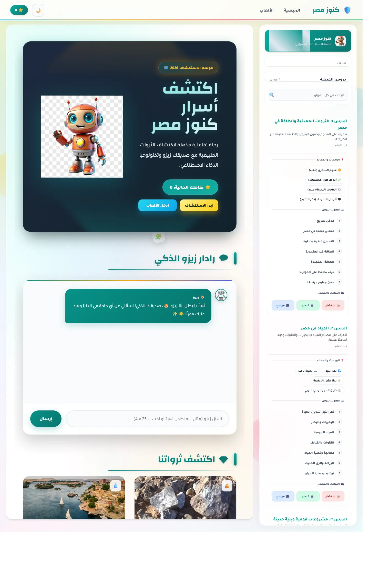
منصة اكتشاف تعليمية تربط الخريطة المصرية بالآثار والمحتوى الثقافي ومساعد ذكي يجعل التعلم أقرب للعبة استكشاف.
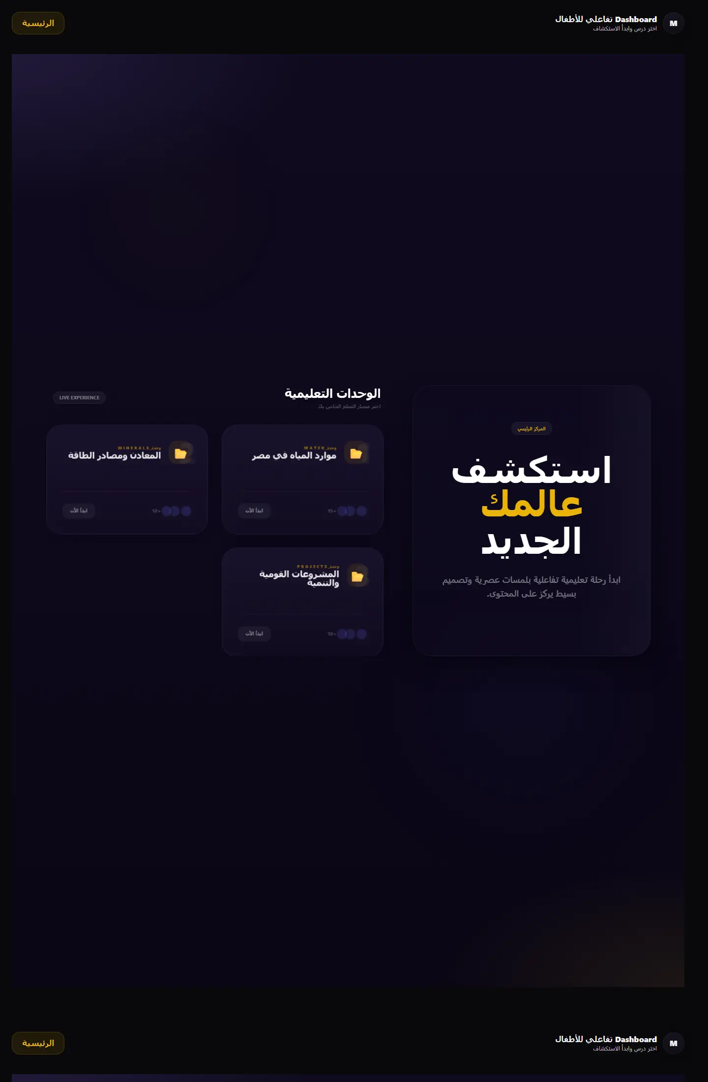
بوابة تعلم جغرافية تعرض الوحدات التعليمية والمهام في قالب منظّم يميل إلى المنتج التعليمي أكثر من لوحة الإدارة التقليدية.
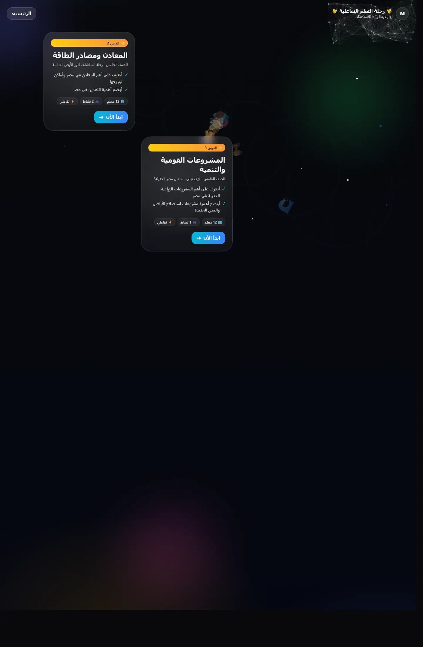
واجهة تعليمية تقدم التعلّم كرحلة متتابعة بدل صفحات منفصلة، مع اهتمام واضح بالتشويق والتنقل المنهجي.