Challenge
What did the project really need?
Turning the project idea into a clear, fast digital experience that builds trust from the first visit.
Project case study
A focused promotional variation that guides visitors directly to the offer and next action.
Project type
Conversion Experience
Audience
Clients and target users
Role
Digital experience design and development
Details made easier
When you open a project page, the goal is to understand the context, not scroll through repeated visuals. These two images create a clean pause between the intro and the details so the decisions behind the work are easier to follow.
Challenge
Turning the project idea into a clear, fast digital experience that builds trust from the first visit.
Approach
A responsive interface was built around user intent, content clarity, and the most important next action.
Outcome
A live, presentation-ready experience that is easy to explore across mobile and desktop.
Focus
عرض مباشر
دعوة واضحة
رحلة قصيرة
Tech stack
Deliverables
Experience highlights
سرعة
وضوح
سهولة الوصول
Project snapshots
Related work
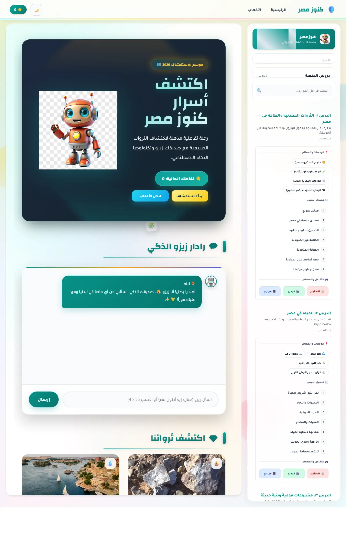
منصة اكتشاف تعليمية تربط الخريطة المصرية بالآثار والمحتوى الثقافي ومساعد ذكي يجعل التعلم أقرب للعبة استكشاف.
Focus
Cultural discovery / Map learning / Guided exploration

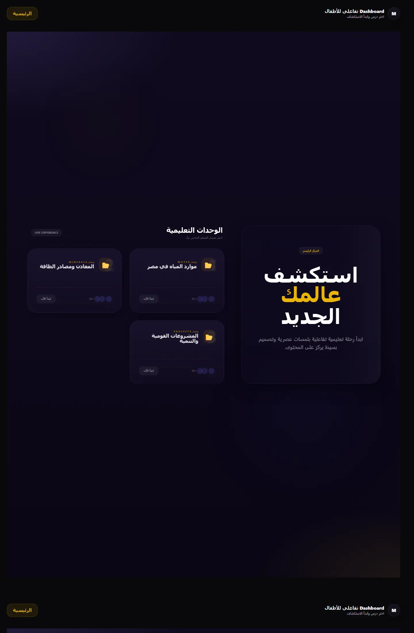
بوابة تعلم جغرافية تعرض الوحدات التعليمية والمهام في قالب منظّم يميل إلى المنتج التعليمي أكثر من لوحة الإدارة التقليدية.
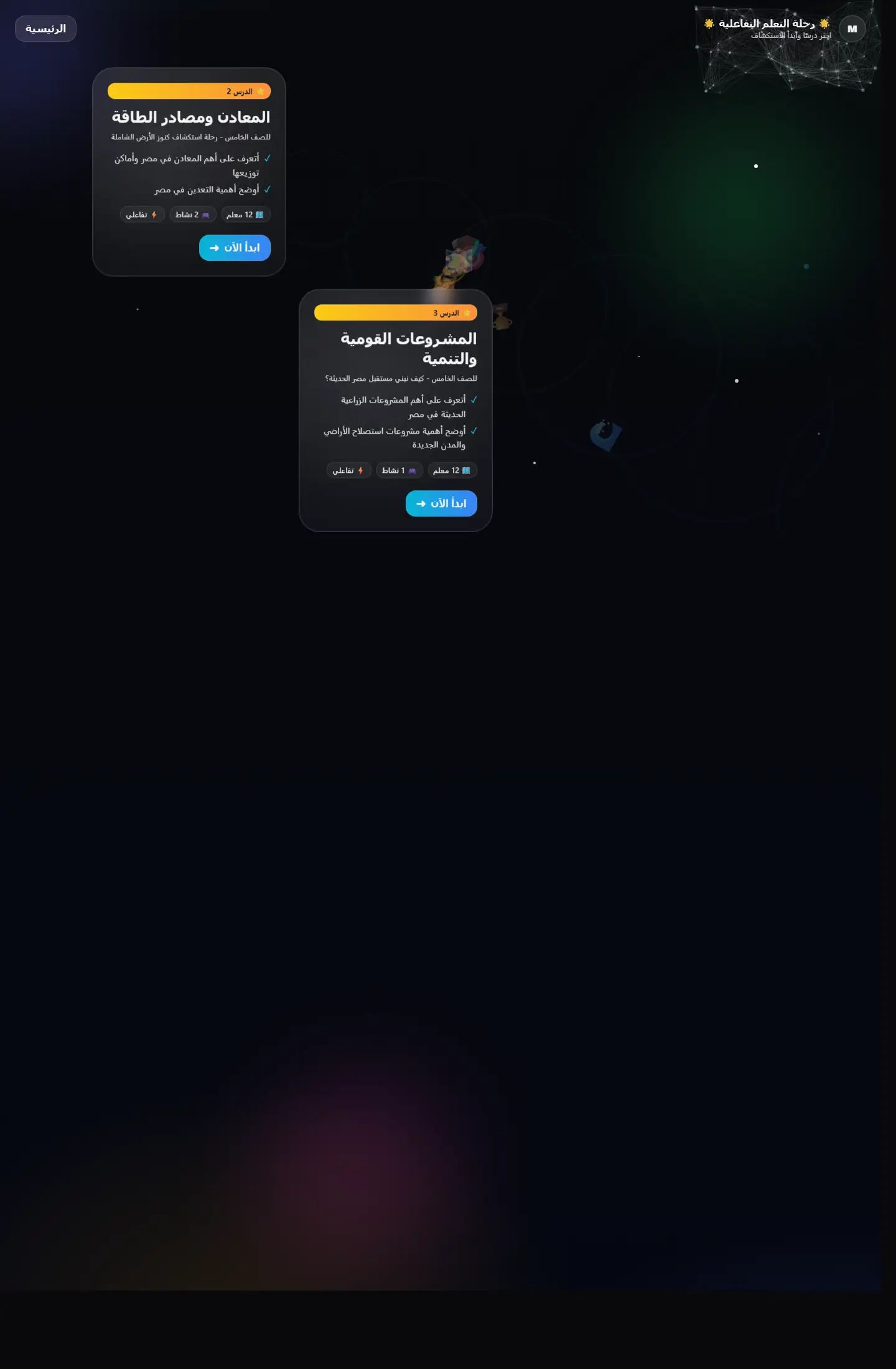
Focus
Module clarity / Educational structure / Portal-like navigation

واجهة تعليمية تقدم التعلّم كرحلة متتابعة بدل صفحات منفصلة، مع اهتمام واضح بالتشويق والتنقل المنهجي.
Focus
Narrative learning / Progression / Visual continuity
Work as decision proof
We add context around each project: why it existed, the challenge, the solution, and what you can understand from browsing the work.
12+
projects to inspect
4
ways to browse work
1
clearer decision after browsing


Page story
This page does not repeat the same Work as decision proof story. Media, stages, and questions are tied to the cloud service offer path so its goal is clear.
Before enrichment
When pages reuse the same hero and questions, visitors feel cloud service offer is only a title change.
Image or video must serve the page question, not act as a background from one repeated family.
After enrichment
We assign a different rhythm to cloud service offer: map, proof wall, dashboard, or editorial narrative depending on the route.
Questions mention cloud service offer directly and explain a different hesitation point instead of copied FAQs.
Purposeful motion
The video acts as a visual pause specific to cloud service offer, not the same feeling as neighboring pages.
The video changes reading rhythm instead of relying on similar cards.
It adds context for cloud service offer and its role inside the journey.
Your questions before deciding
Because cloud service offer answers a different question, and repeated design hides that difference from the client.
Problem, solution, stages, and questions are tied to cloud service offer and its role inside the section.
No. Identity stays consistent through color and typography, while presentation rhythm changes by page goal.
Good work is not only displayed; it explains why you can trust the execution.