Challenge
What did the project really need?
المطلوب كان تقديم الفكرة التعليمية بصورة احترافية لا تبدو بدائية، مع الحفاظ على سهولة الاستخدام ووضوح المعلومة.

Project case study
هذا العمل يجمع بين الخرائط التعليمية والشرح الموجّه بطريقة تصنع منتجًا واضحًا عند عرضه على مدرسة أو جهة تعمل في المحتوى.
مشروع يربط بين الخريطة والمحتوى الدراسي في قالب يبدو أقرب لمنتج تعليمي متكامل ومباشر.
Project type
موقع/منصة تعليمية
Audience
مدارس، ناشرو محتوى، ومنصات تعليم رقمي
Role
تغليف المحتوى التعليمي في شكل منتج قابل للعرض
Details made easier
When you open a project page, the goal is to understand the context, not scroll through repeated visuals. These two images create a clean pause between the intro and the details so the decisions behind the work are easier to follow.
Challenge
المطلوب كان تقديم الفكرة التعليمية بصورة احترافية لا تبدو بدائية، مع الحفاظ على سهولة الاستخدام ووضوح المعلومة.
Approach
تم الاعتماد على شاشات تشرح الفكرة مباشرة، مع روابط بين الدرس والخريطة وطبقات تنقل لا تربك المستخدم.
Outcome
النتيجة مشروع يمكن عرضه كمنصة تعليمية قائمة بذاتها، ويُظهر قدرة جيدة على دمج المحتوى مع التفاعل المكاني.
Focus
Map education
Product framing
Usability
Tech stack
Deliverables
Experience highlights
وضوح بصري
تدرج معرفي
محتوى موجّه
سلاسة التنقل
Project snapshots
Same idea editions
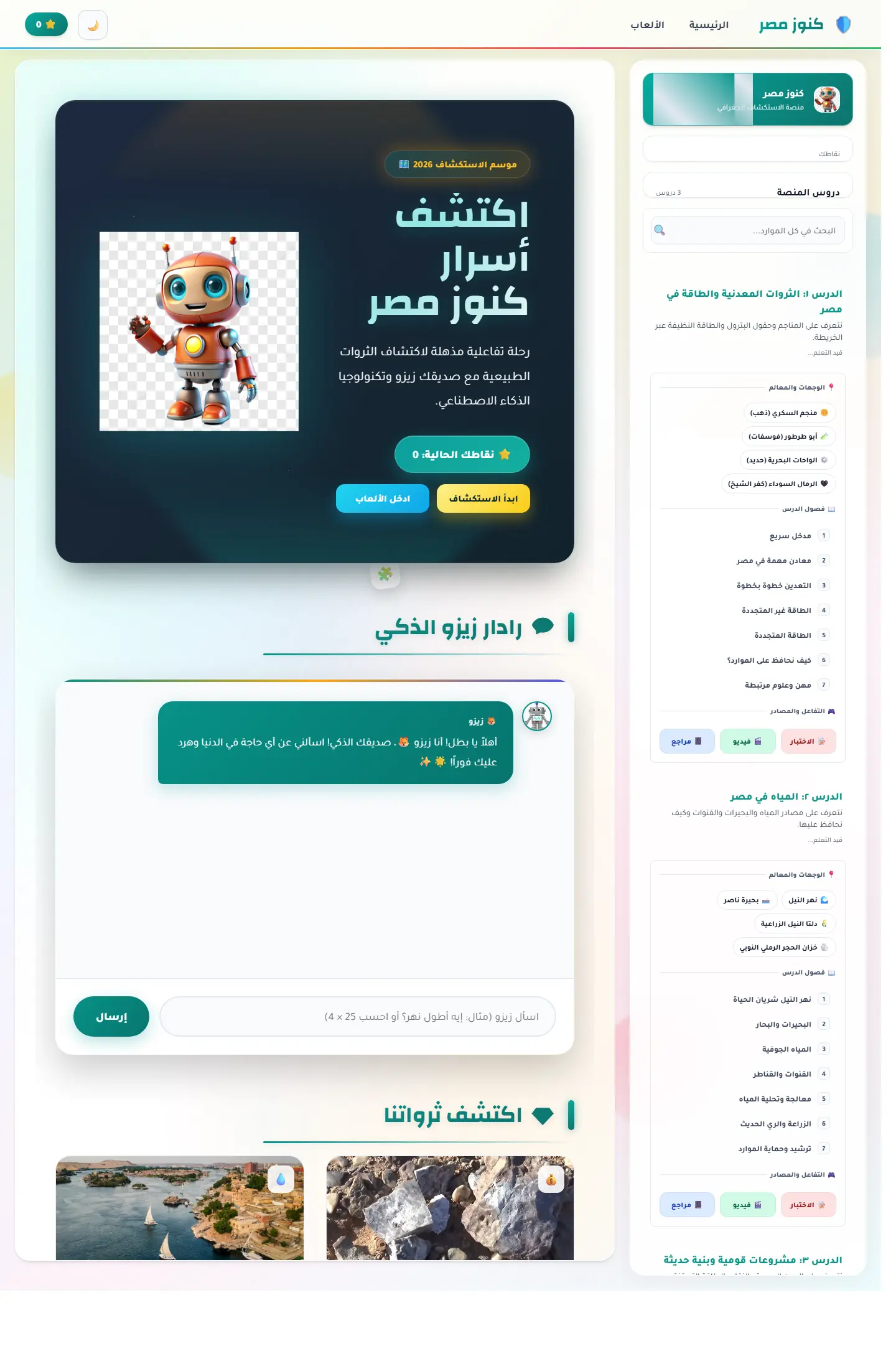
منصة اكتشاف تعليمية تربط الخريطة المصرية بالآثار والمحتوى الثقافي ومساعد ذكي يجعل التعلم أقرب للعبة استكشاف.
Focus
Cultural discovery / Map learning / Guided exploration
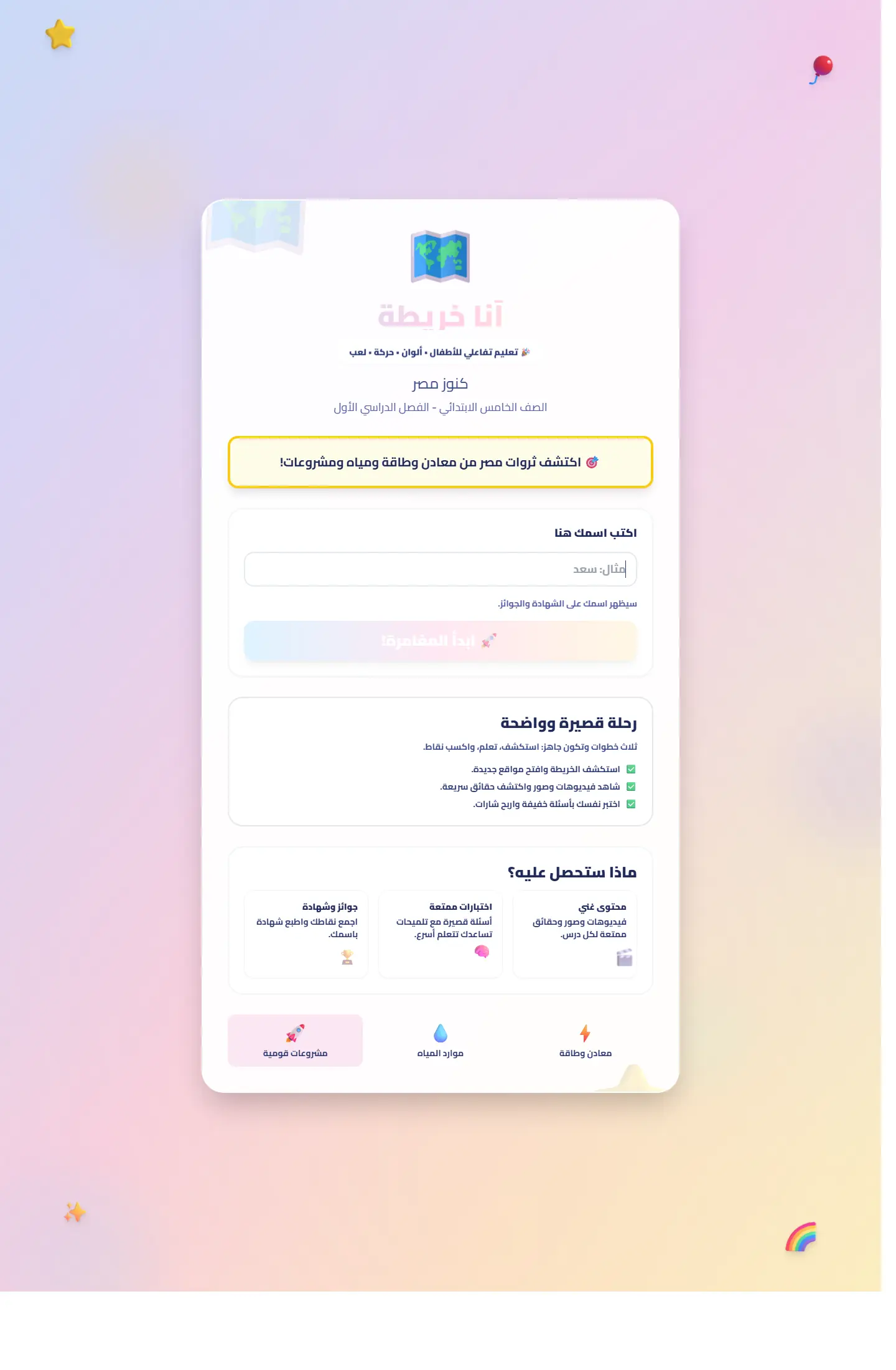
نسخة تعليمية موجّهة أكثر لمحتوى الصف الخامس، مع هيكل أوضح للدرس والخريطة والتمارين البصرية.
Focus
Lesson framing / Age fit / Interactive guidance
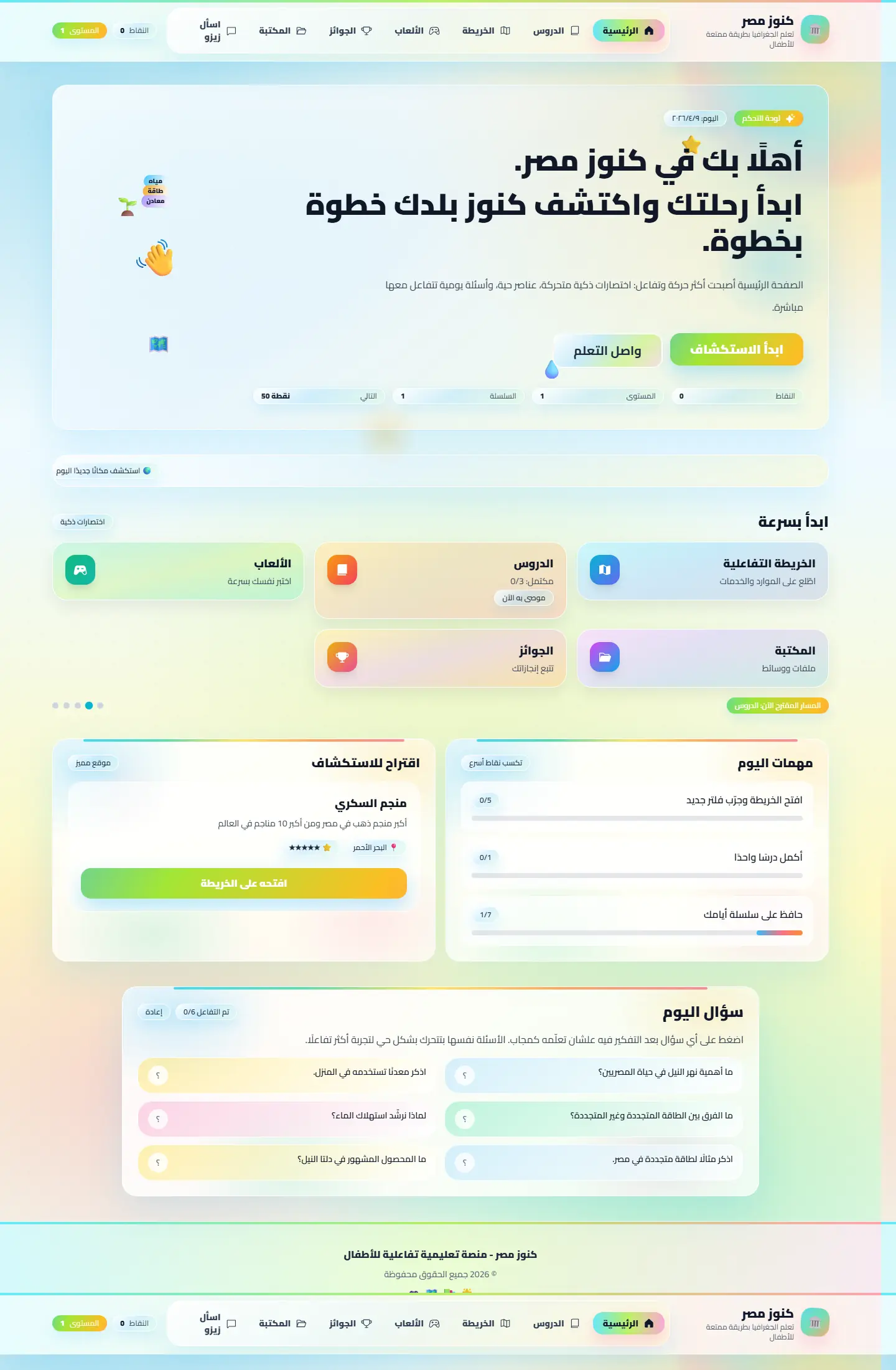
إصدار يقدّم كنوز مصر كمنصة أوسع للأطفال مع اهتمام أكبر بالإبهار والهوية التعليمية المرحة.
Focus
Playful visuals / Learning rhythm / Engagement
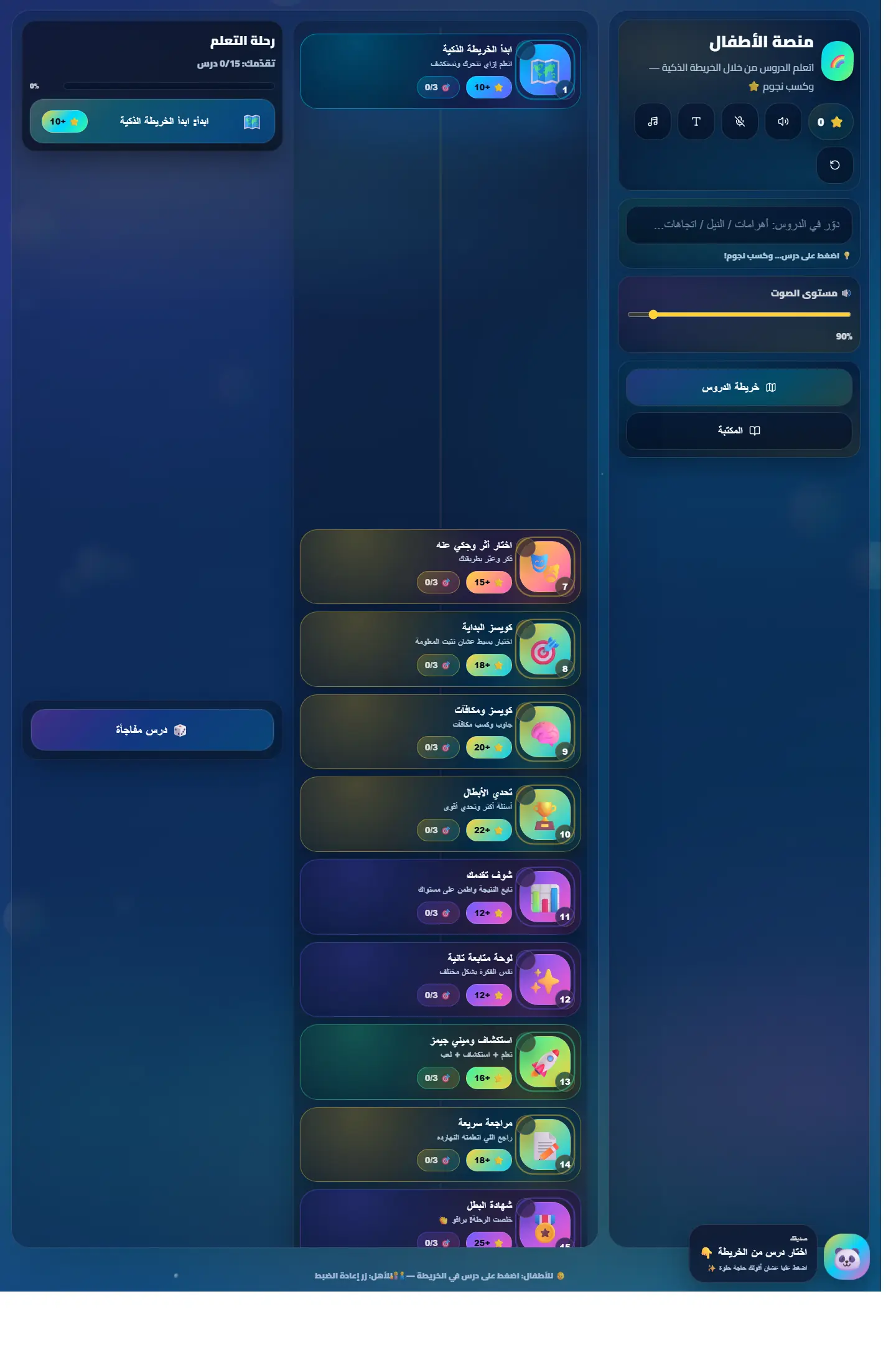
منصة تضع الخريطة كعنصر أساسي في تعلّم الأطفال، مع قالب أبسط يركز على الفكرة الرئيسية بسرعة.
Focus
Concept clarity / Simplicity / Kid-friendly tone
Related work
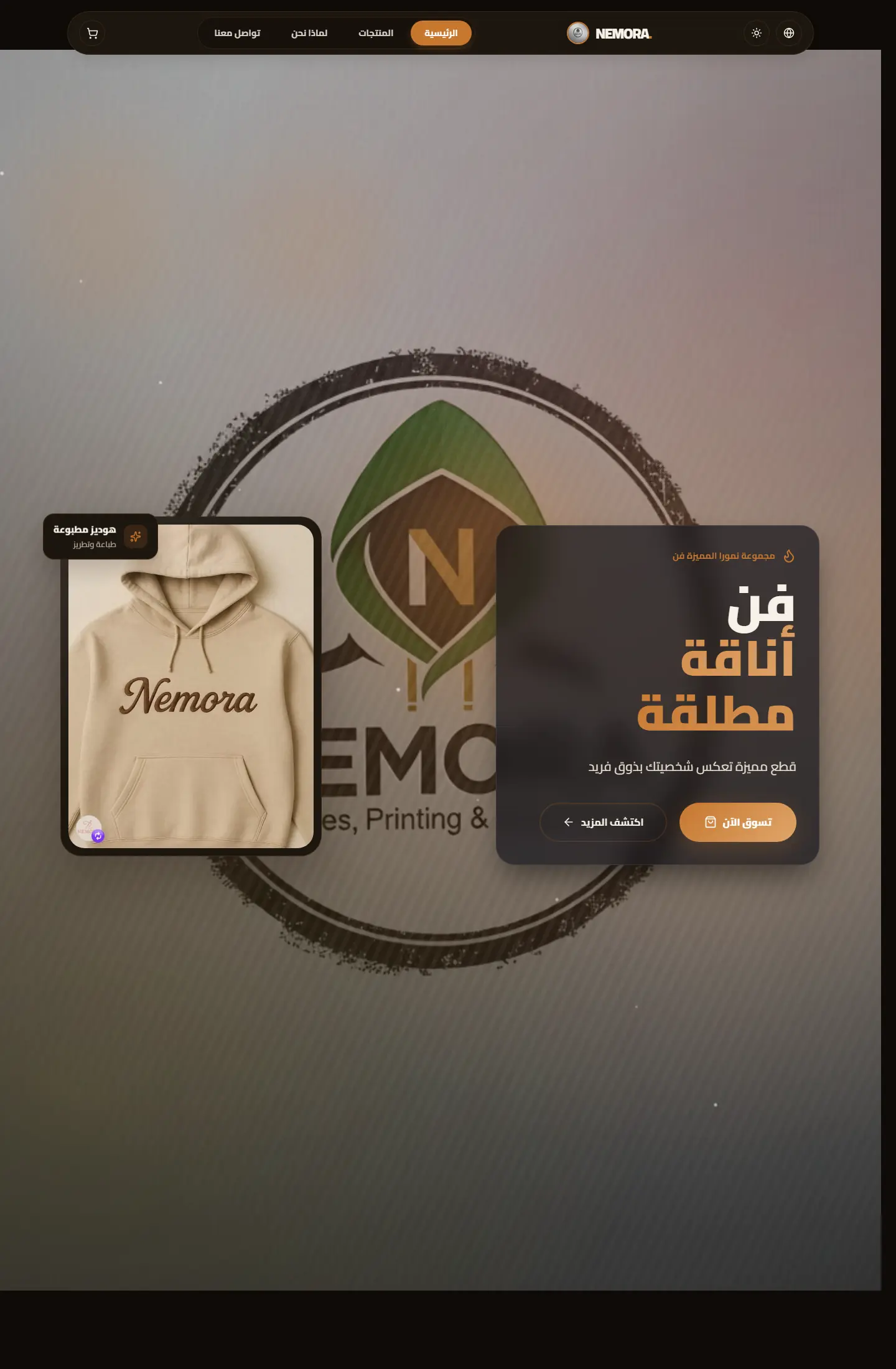
متجر رقمي لبراند ملابس مطبوعة يركز على إبراز الهوية، وضوح المنتج، وصناعة واجهة بيع تبدو حديثة ومريحة.
Focus
Brand presence / Product clarity / Conversion flow
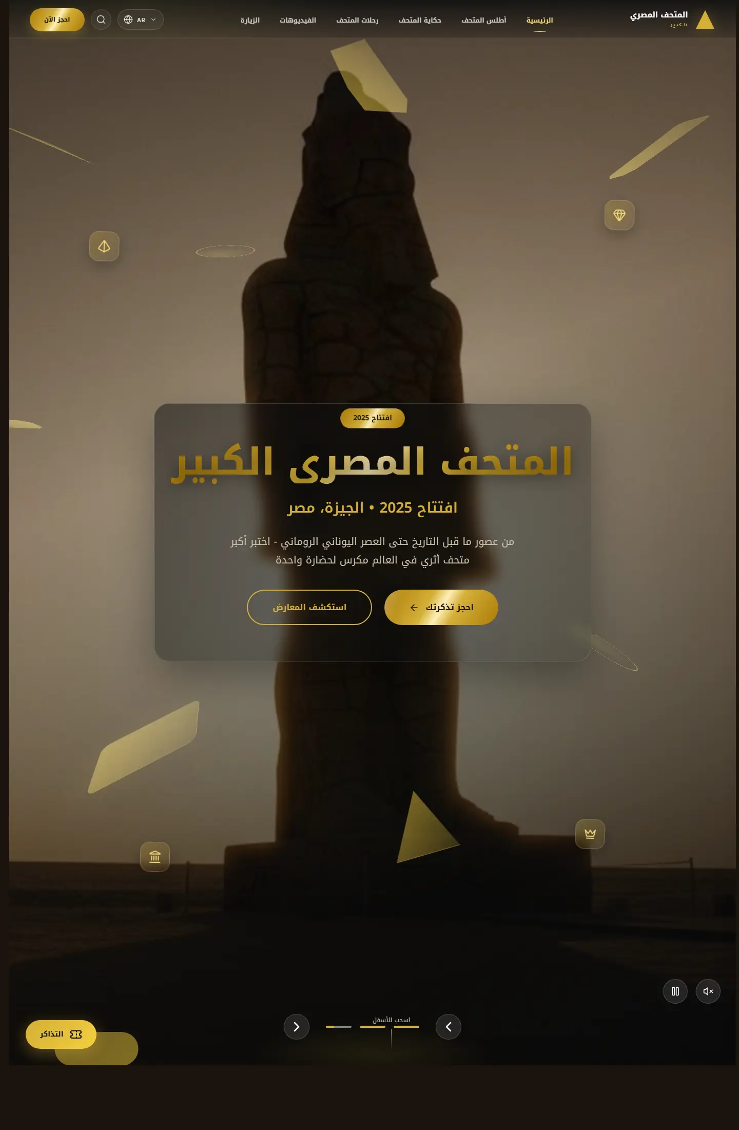
موقع ثقافي يقدّم تجربة عرض متحفية رقمية تمزج بين المعلومة، الإبهار البصري، وروح الاكتشاف.
Focus
Institutional feel / Immersive imagery / Cultural framing
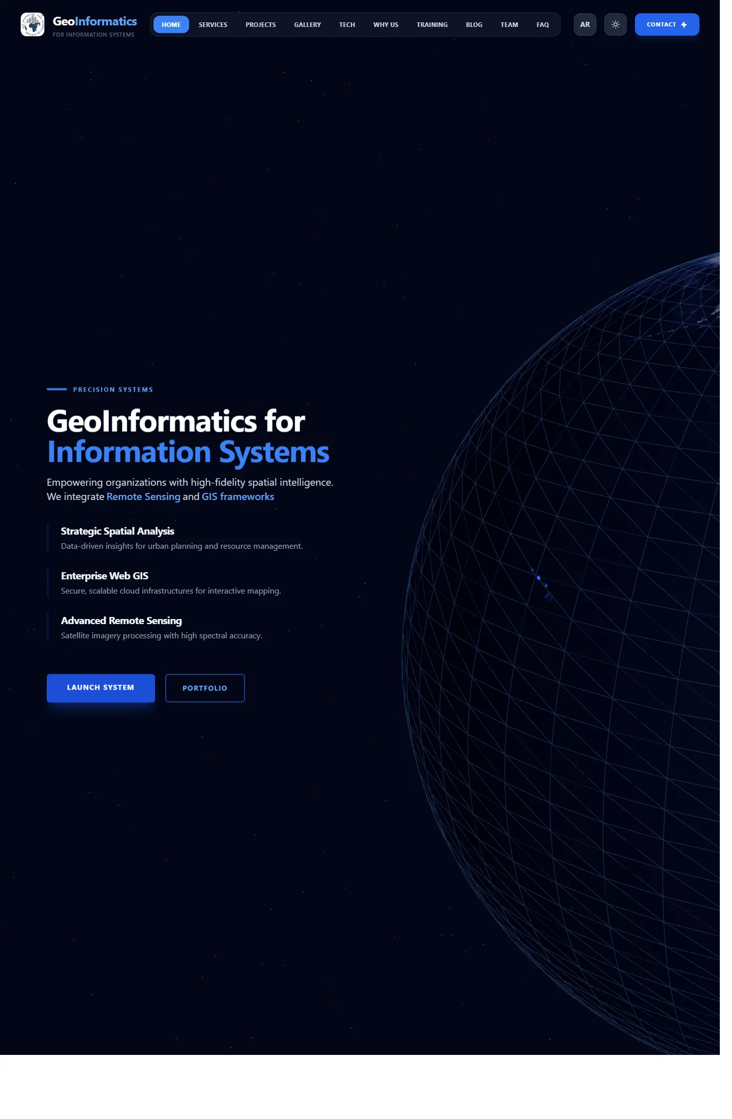
واجهة شركة تعمل في نظم المعلومات الجغرافية والاستشعار عن بعد، مع تركيز واضح على الخبرة والخدمات التقنية.
Focus
Technical clarity / Service packaging / Professional trust
Work as decision proof
We add context around each project: why it existed, the challenge, the solution, and what you can understand from browsing the work.
12+
projects to inspect
4
ways to browse work
1
clearer decision after browsing
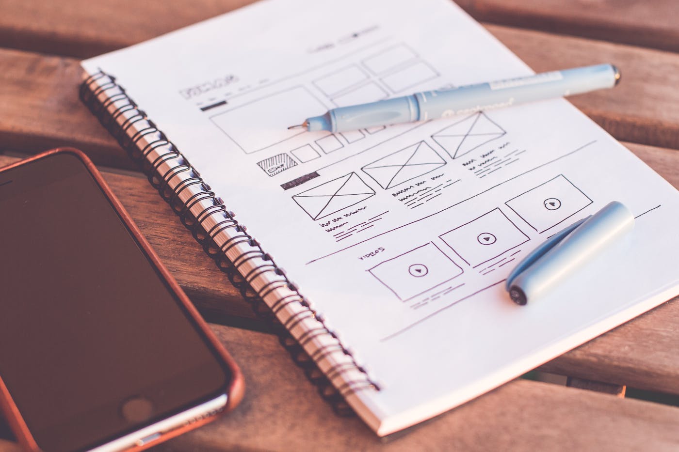
Page story
This page does not repeat the same Work as decision proof story. Media, stages, and questions are tied to the smart educational maps path so its goal is clear.
Before enrichment
When pages reuse the same hero and questions, visitors feel smart educational maps is only a title change.
Image or video must serve the page question, not act as a background from one repeated family.
After enrichment
We assign a different rhythm to smart educational maps: map, proof wall, dashboard, or editorial narrative depending on the route.
Questions mention smart educational maps directly and explain a different hesitation point instead of copied FAQs.
Purposeful motion
The video acts as a visual pause specific to smart educational maps, not the same feeling as neighboring pages.
The video changes reading rhythm instead of relying on similar cards.
It adds context for smart educational maps and its role inside the journey.
Your questions before deciding
Because smart educational maps answers a different question, and repeated design hides that difference from the client.
Problem, solution, stages, and questions are tied to smart educational maps and its role inside the section.
No. Identity stays consistent through color and typography, while presentation rhythm changes by page goal.
Good work is not only displayed; it explains why you can trust the execution.