Art of designing
experiences & interactive interfaces
Explore Notaq's interactive gallery showing aesthetic precision, clean software engineering, and behind-the-scenes assets.
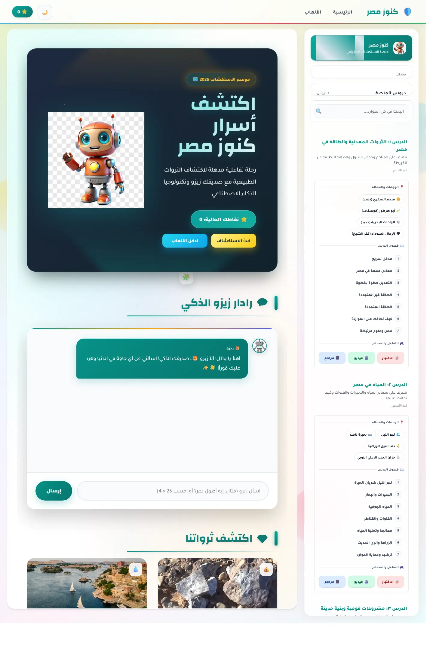
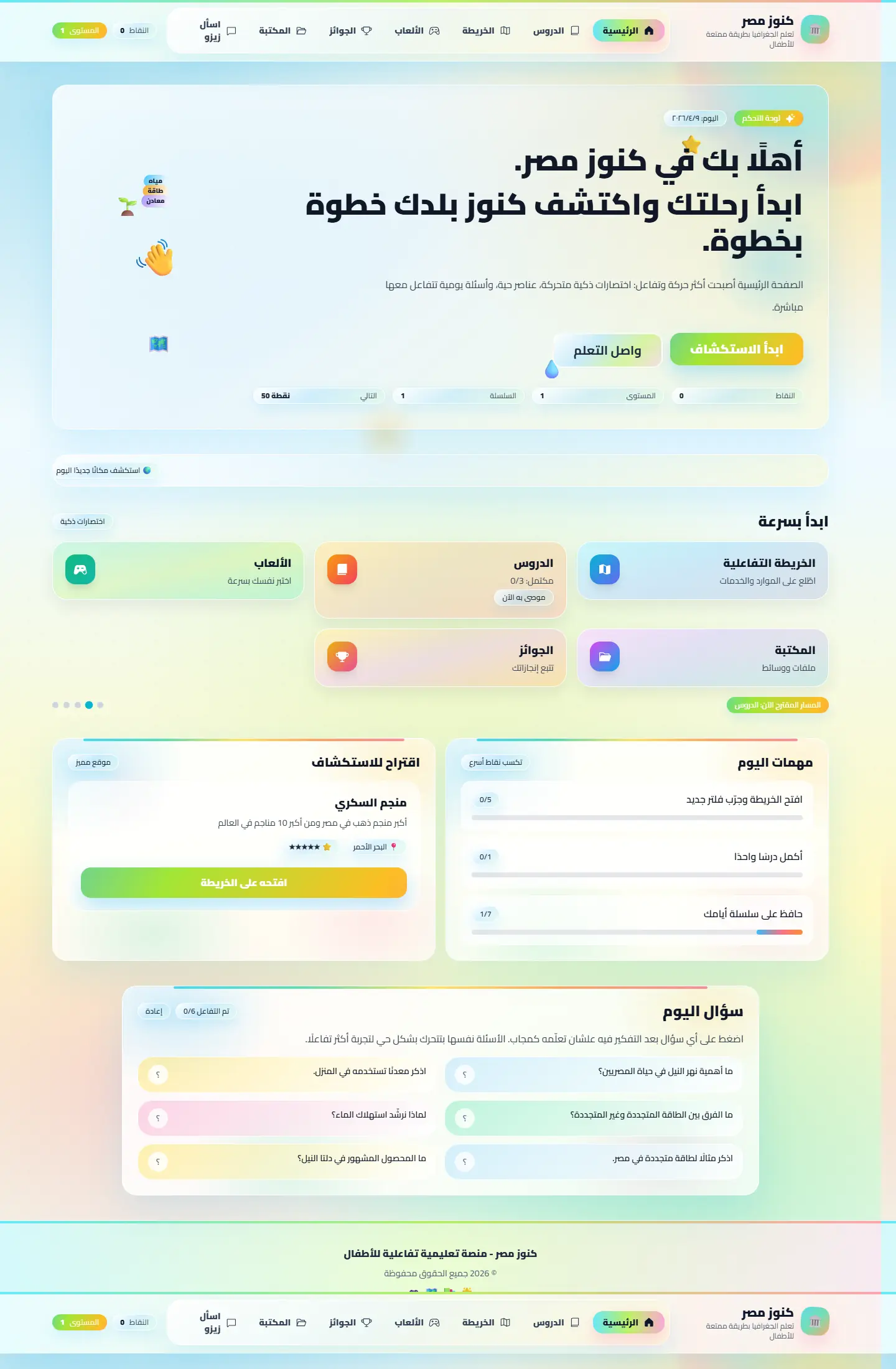
Kunuz Misr Interactive Maps: Before & After Redesign
Drag the slider in the center to compare how we restructured the map platform interface to look modern and readable.
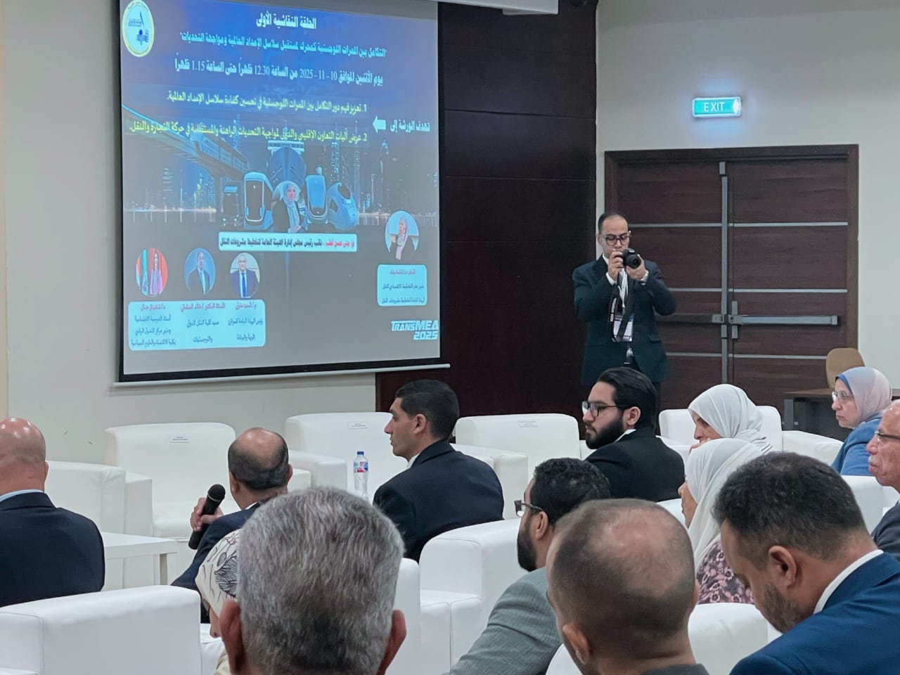
Gallery without clutter
Explore visuals as selected moments, not a long distracting row.
A gallery is stronger when it selects meaningful moments instead of throwing everything at once. These two visuals carry the overall feel while keeping the page focused and easy to continue.
.png)
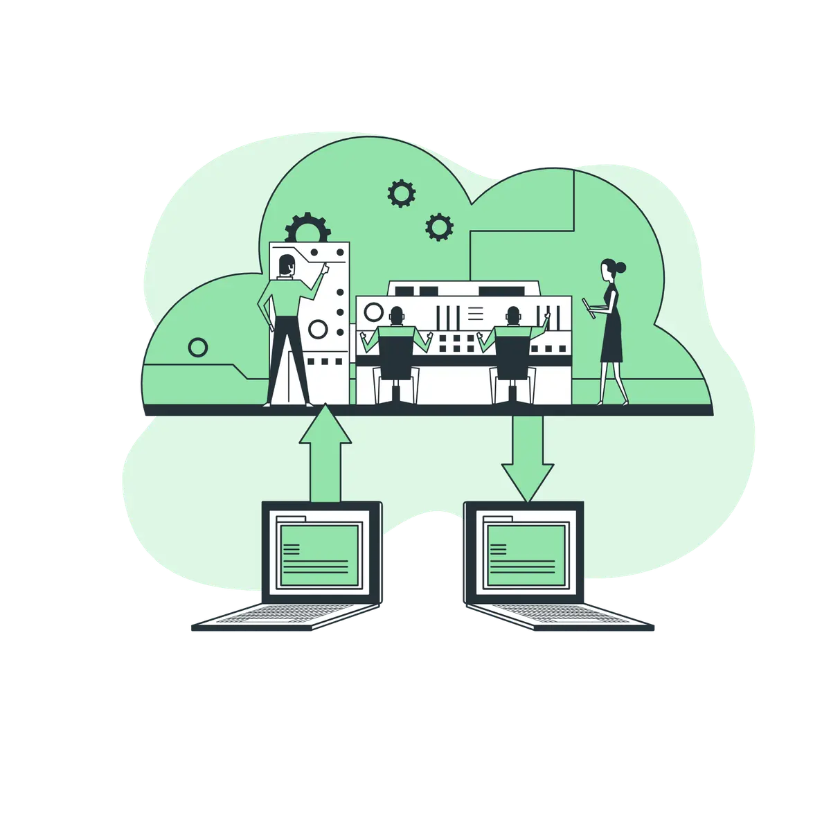
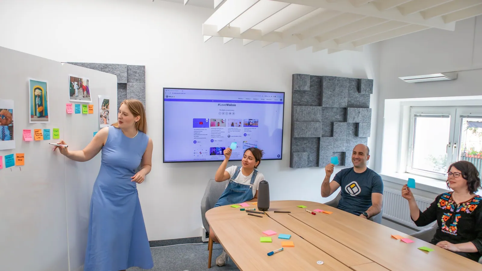
E-commerce Platform Design
Modern e-commerce interface with seamless checkout experience and HSL system.
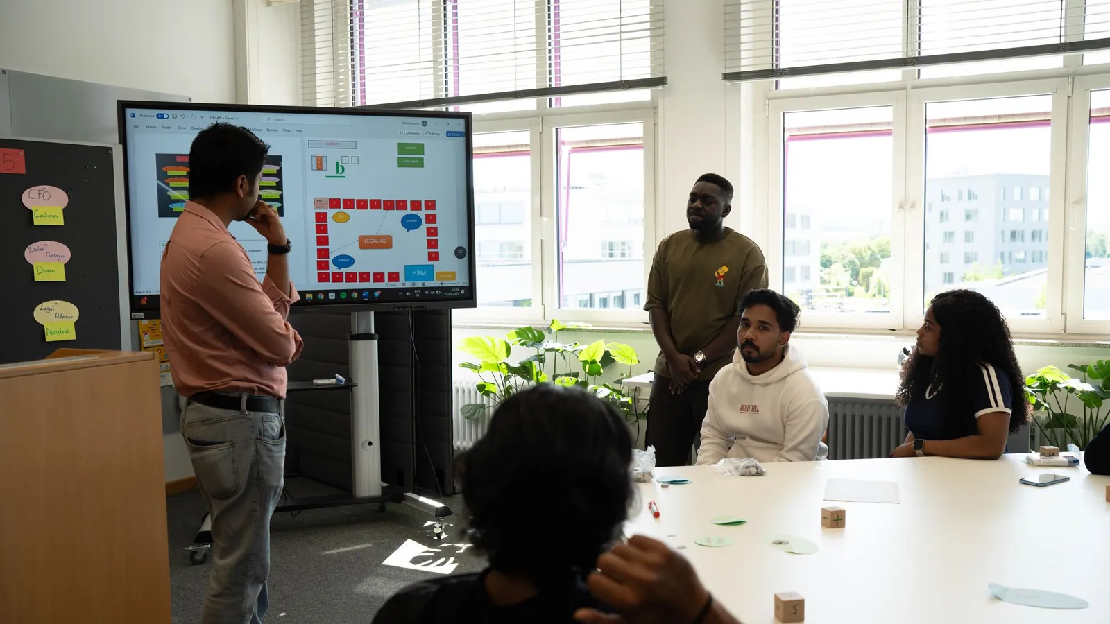
Dashboard UI System
Enterprise dashboard with advanced charts and analytics widget system.

Educational Platform
Interactive learning maps platform supporting 50K+ secondary students.
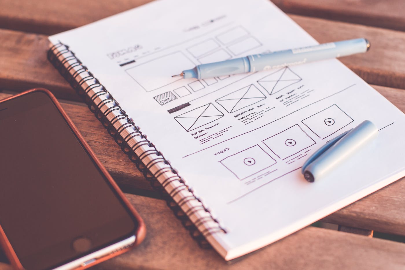
Design Process Video
Behind the scenes walkthrough of Notaq's daily UX design sprint and wireframes.
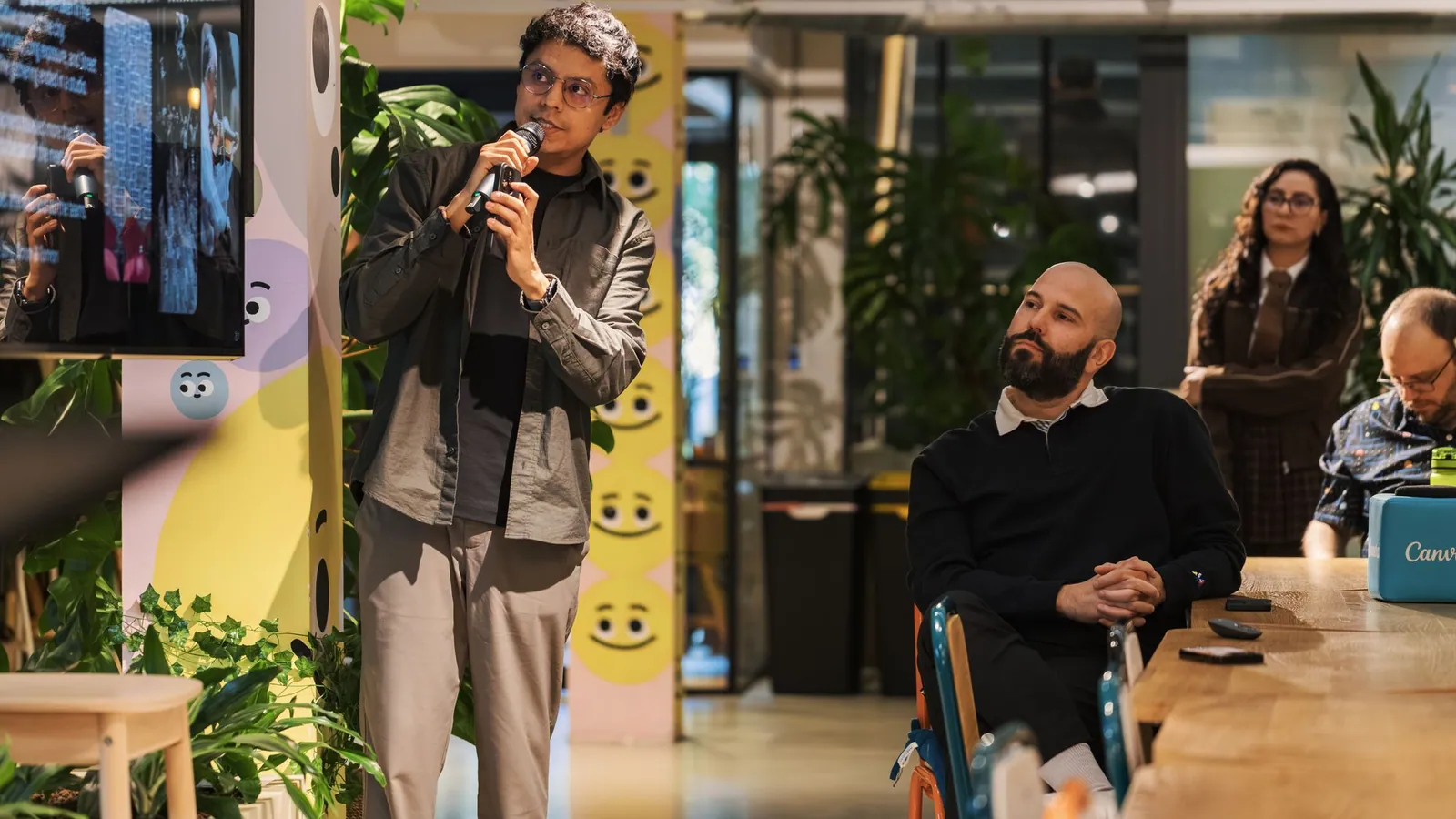
Mobile App Interface
Global iOS and Android app optimized for loading speed and micro-interactions.
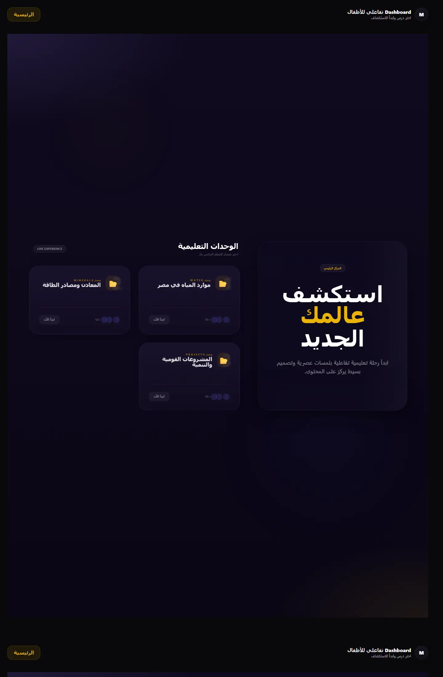
Development Workflow
Automated CI/CD testing and React components optimization pipeline.
Page story
A gallery alone does not tell the story
You do not need visuals alone; you need to see how we think, solve complexity, and shape the launched project.
Before enrichment
Screens without context
A beautiful screenshot is not enough without the challenge and result.
Hard to compare
Notaq organizes work by type and value so you find what resembles your case.
After enrichment
Mini case studies
We add the project reason, decision, and expected impact.
Varied visual proof
Images, video, metrics, and links guide deeper understanding.
Your questions before deciding
Answers that reduce hesitation before contact
Are these details important for work pages?
Yes. The company page should not only look good; it should make the value clear, explain the workflow to visitors, and make the next step after contact obvious from the start.
Will richer content slow the decision?
Not when the content is visually structured. Short sections, comparisons, and FAQs help your visitor understand faster because they answer objections before they turn into hesitation.
Are images and videos just decoration?
No. Every image or video should support the visitor�s decision: clarify what they will get, build trust in the company, or give them a visual pause that keeps reading easy.
Make every project a reason to reach out
Good work is not only displayed; it explains why you can trust the execution.